Typography is more than picking a font and typing out your content. It’s an art form, a science, and one of the most crucial tools we have for building visually compelling designs. From ancient scribes chiseling letters into stone to modern designers fine-tuning pixels on a screen, working with type has been a long, evolving journey. Let’s walk through it.
A brief history of typography
The history of typography is really a history of human ingenuity, all in pursuit of one goal: communicating clearly. Before the digital era, typography lived entirely in physical craftsmanship. Early scribes hand-lettered manuscripts stroke by stroke, each one demanding precision and patience. Then came the moment that changed everything: Johannes Gutenberg’s printing press, in the mid-15th century.
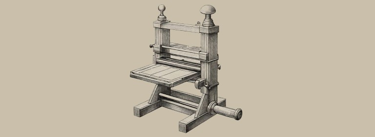
Gutenberg’s press is one of the most transformative inventions in history, full stop. For the first time, books, pamphlets, and newspapers could be mass-produced, and knowledge could spread beyond the elite. His invention of movable type, individual metal letters that could be arranged and rearranged to form different pages, laid the foundation for everything we now call typography. Those early typefaces were heavily influenced by handwritten scripts, often ornate, closely mirroring the calligraphy of the era.
Move forward to the Renaissance, and typography evolves alongside classical ideals of beauty and proportion. Roman typefaces, inspired by inscriptions on ancient monuments, gave us iconic type families like Garamond, Bembo, and Baskerville. These fonts weren’t just functional. They were expressions of culture, philosophy, and artistry, with every letterform meticulously crafted, every curve and serif considered, all in pursuit of harmony and elegance on the printed page.
By the 18th and 19th centuries, the Industrial Revolution demanded new, more efficient typefaces. Didot and Bodoni, with their stark contrast between thick and thin strokes, embodied the precision of the machine age. These fonts marked a real shift in typographic design, a move away from decoration and toward function.
The 20th century gave us iconic sans-serif typefaces like Helvetica and Futura, as modernism swept through design. Typography became about simplicity, clarity, and universality, stripping away the flourish in favor of clean lines and geometric forms. As advertising, packaging, and corporate branding rose, typography took on a new role. It wasn’t just conveying information anymore. It was defining brand identity.
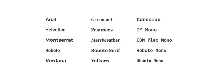
Then came the digital revolution. Computers and design software pulled typography from the physical world into the virtual one, and suddenly designers had access to endless fonts, adjustable down to the pixel. The rise of web typography in the early 2000s pushed things further still. Typefaces now had to work across screens, devices, and resolutions, which ushered in an era of responsive design, where typography had to be legible and adaptable, not just one or the other.
Today, typography is more diverse than it’s ever been. Thousands of typefaces are available to us, from retro-inspired fonts to cutting-edge variable fonts, and we can experiment with personality, emotion, and readability like never before. But the core principles haven’t moved an inch: typography is about harmony between form and function, about evoking emotion, about making sure the message is clear. It’s a craft rooted in centuries of history, with a future as dynamic as the tools we build it with.
Understanding typography terminology
Before we get into the practical side of working with type, let’s get the vocabulary straight. Knowing these terms won’t just make you sound like a typography pro. It’ll help you make sharper, more precise typographic decisions.
Font vs. typeface
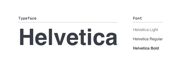
People use these terms interchangeably all the time, but they’re not the same thing. A typeface, like Helvetica or Times New Roman, is the family. A font is the specific weight, style, or size within that family, Helvetica Bold, say, or Times New Roman Italic. The typeface is the overall design. The font is the specific version of that design you’re actually using.
Serif vs. sans serif
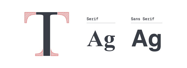
This distinction matters a lot. Serif fonts, like Times New Roman or Georgia, have small decorative strokes, serifs, at the ends of each letter. We tend to associate them with traditional, formal, or academic settings. Sans serif fonts, like Arial, Helvetica, and Futura, drop those strokes entirely, landing cleaner and more modern. They read as minimalist and straightforward, which is exactly why they dominate digital design, where readability on screens is everything.
Uppercase vs. lowercase
Uppercase letters, A, B, C, are typically reserved for emphasis, headings, or making a statement. They carry formality and can convey authority. But lean on them too hard in long sentences, and it starts to feel like SHOUTING. Nobody wants that.
Lowercase letters, a, b, c, are the default for body text, and for good reason. They’re easier to read and feel more relaxed, more approachable. Lowercase is the right call for anything conversational or meant to be scanned quickly, which is especially important in UI design.
Superscript vs. subscript
Superscript raises text slightly above the baseline, as in “E=mc².” It shows up in mathematical expressions, footnotes, and ordinals (1ˢᵗ, 2ⁿᵈ), and it’s also a handy stylistic choice for adding small details without breaking the flow of a sentence. Subscript does the opposite, dropping text slightly below the baseline, as in H₂O. It’s mostly a scientific and mathematical convention, useful for conveying extra information without pulling focus.
Kerning
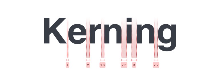
Kerning is the adjustment of space between two specific characters in a word. The goal is even spacing and a more visually appealing result. Letters like “A” and “V” often need special attention, since their slanted forms can create awkward gaps. Get kerning right, and letters sit together harmoniously, better readability, better aesthetics, at the same time.
Leading
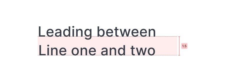
Named after the strips of lead that typesetters once placed between lines of text, leading refers to the vertical space between lines. Some call it line spacing. Tighten it, and text feels more compact. Loosen it, and the design breathes, feeling more open and airy. Same tool, opposite effect, depending on which way you turn it.
Tracking
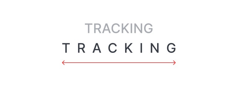
Where kerning adjusts space between individual characters, tracking adjusts spacing across an entire word or line. Tighten tracking, and letters pull closer together. Loosen it, and they spread apart. It’s a lever for density versus openness, shaping how a whole block of text feels at a glance.
Baseline
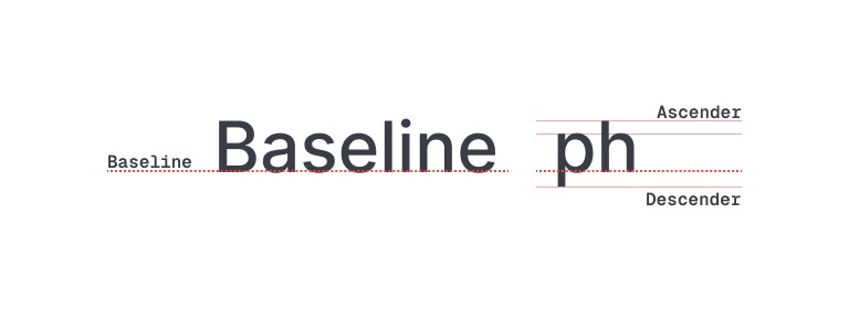
This is the invisible line every letter sits on, keeping text organized and aligned. Some letters, like “p” and “g,” dip below it, creating descenders. Others, like “h” and “k,” extend above it, creating ascenders.
X-height
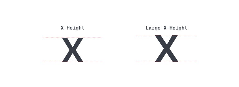
X-height is the height of lowercase letters, usually measured against the lowercase “x” in a given typeface. A larger x-height makes a font read bigger and more legible. A smaller one gives it a more elegant, compact feel.
Cap height
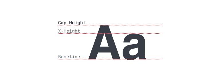
Cap height is the height of the capital letters in a typeface. It shapes how tall text looks relative to lowercase letters, and it influences the perceived size of the font as a whole.
Ascender and descender
Ascenders are the parts of lowercase letters that rise above the x-height, like the vertical stroke of a lowercase “h.” Descenders fall below the baseline, like the tail of a lowercase “g” or “p.” Together, they give a font its rhythm and flow, shaping how balanced or dynamic the text feels.
Ligature
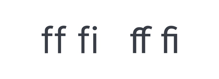
A ligature is two or more letters combined into a single glyph, for readability or aesthetics or both. Common ones include “fi,” “fl,” and “ff,” where the letters naturally blend into one another. Ligatures earn their keep especially in serif fonts, where letterforms can otherwise clash or overlap awkwardly.
Weight
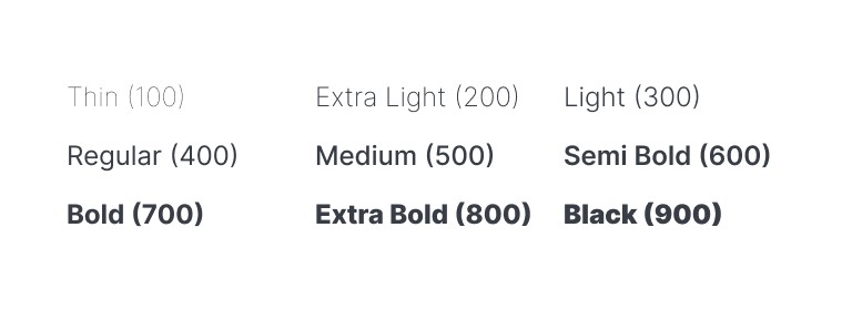
Weight refers to the thickness of a font. Regular, Bold, Light, Semibold, Black, these are all weights. Varying weight creates contrast and hierarchy, making it easier for readers to tell different types of information apart at a glance.
Italic vs. oblique
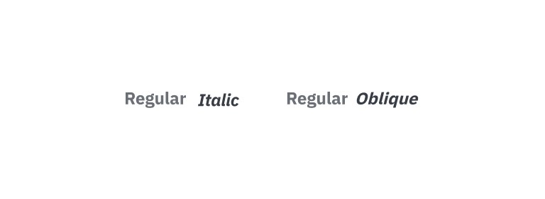
Both describe slanted text, but they’re not the same thing. Italic fonts are specially designed versions of the original typeface, with unique letterforms built for the slant. Oblique fonts are simply the regular font, slanted, with no change to the letter shapes themselves.
Alignment
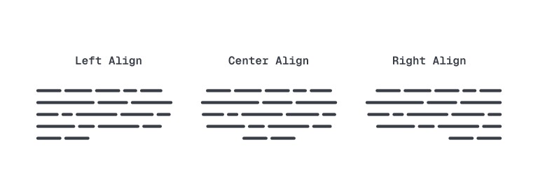
Alignment is how text is positioned within its space: left (the most common, and the most readable), center, right, or justified, where text stretches to fill the width of the page. Each has its place, depending on the context.
Hierarchy
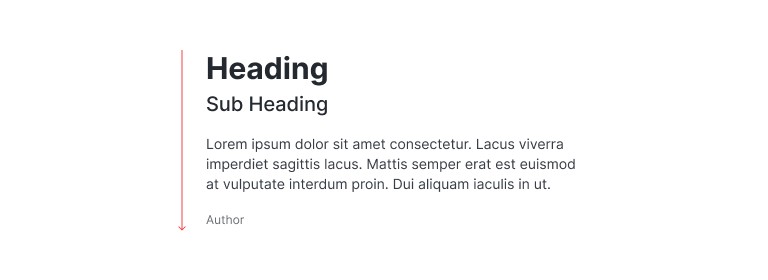
Hierarchy is how we use typography to establish order and direct the reader’s attention. It comes down to one question: what’s most important here? Once you know the answer, size, weight, color, and placement all become tools for making that answer obvious.
Measure
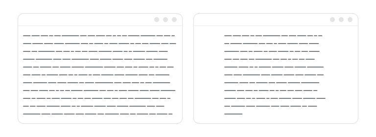
Measure is the length of a line of text. Too short, and lines feel cramped. Too long, and readers struggle to track from one line to the next. The sweet spot typically falls between 45 and 75 characters per line.
Contrast
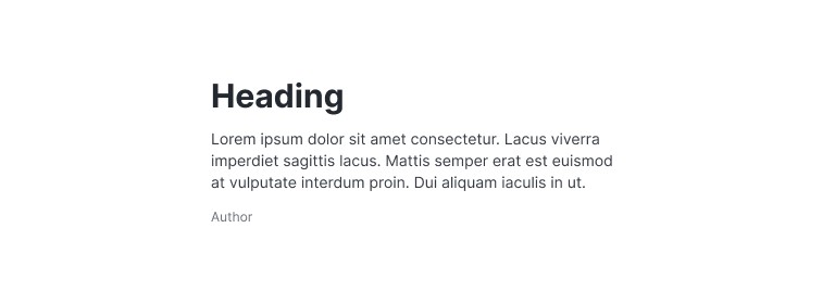
In typography, contrast isn’t just about color. It’s about making elements stand apart through size, weight, or typeface pairing. High contrast, a bold header against lighter body text, draws attention to key information. Low contrast creates something more subtle, more uniform.
Orphan and widow
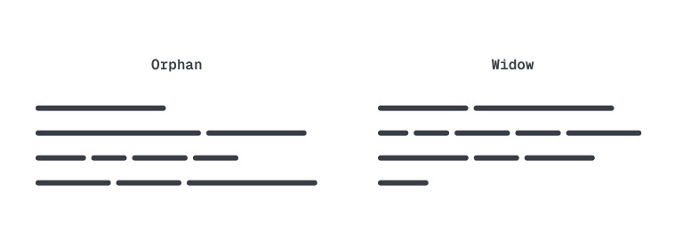
An orphan and a widow are unfortunate mishaps: a single word or a very short line left dangling at the start or end of a column or page. They break the flow of a reader’s eye, and we typically avoid them by tweaking line breaks or adjusting the layout.
Get comfortable with these terms, and you have the foundation for clear, intentional, aesthetically pleasing typography, the kind that not only looks polished but communicates with precision.
Types of typefaces: choosing the right style
Serif: the classic choice
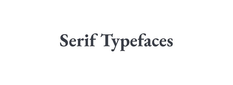
Serif fonts have small strokes, or “feet,” attached to the ends of letters. Think Times New Roman or Georgia. They carry tradition, and they signal professionalism, sophistication, and trust.
We reach for them in formal settings: newspapers, books, law firms. The extra strokes help guide the reader’s eye from one character to the next, which makes serif fonts a strong choice for long bodies of text in print. On digital screens, though, especially small ones, serif fonts can start to feel cluttered. That’s usually the cue to reach for sans serif instead.
Best for: formal documents, print media, academic papers, and anything that needs to convey authority and reliability.
Sans serif: modern and minimal
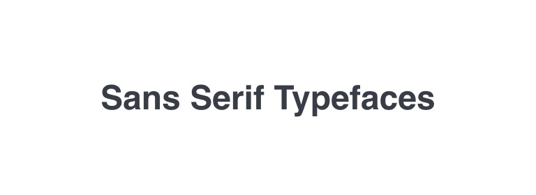
Sans serif fonts drop the decorative strokes entirely, landing clean and straightforward. Helvetica, Arial, Roboto, all familiar names, all sans serif.
These fonts offer clarity and simplicity, which is exactly what digital interfaces need. They read as modern and approachable, which explains why tech brands, apps, and websites lean on them so heavily. They work well in both headings and body text, especially on screens, where they help keep visual clutter down.
Best for: websites, mobile apps, tech branding, user interfaces, and anywhere screen readability is the priority.
Monospace: technical and precise
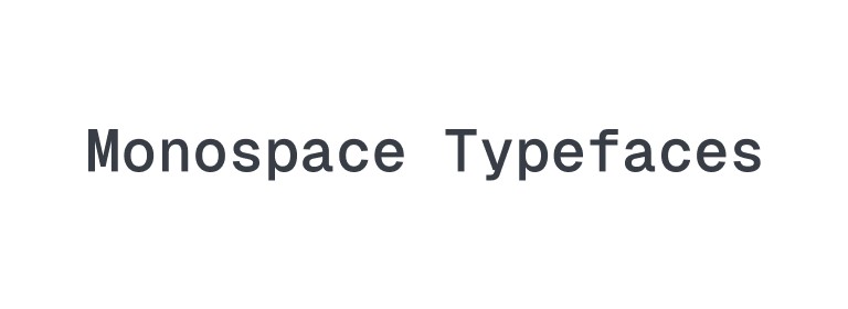
Monospace fonts, like Courier or Consolas, give every character the same amount of horizontal space. No exceptions.
That’s why they’re the default for coding and technical environments. The uniform spacing creates a consistent, grid-like structure that’s easy to follow when reading or writing code. Monospace fonts won’t give you the elegance or flexibility of other typefaces, but they win on clarity and precision, and they can lend a design a retro or tech-inspired edge.
Best for: coding, technical documentation, or a vintage or minimalist aesthetic.
Display: big, bold, and attention-grabbing
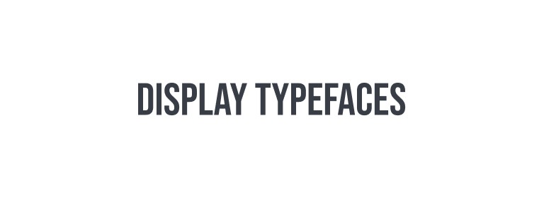
Display fonts exist to stand out. Impact, Bebas Neue, Lobster, these aren’t subtle, and they’re not trying to be.
They’re built for headlines, posters, anywhere you want to make an immediate statement. Their job is to capture attention, not blend into the background. Use them sparingly, though. Bold and elaborate by design, display fonts can overwhelm a layout and muddy the message if you lean on them too hard.
Best for: headlines, posters, banners, and designs that need to make an immediate impact.
Script: elegant or casual
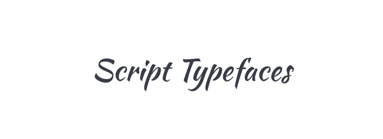
Script fonts imitate cursive handwriting, adding a personal or artistic touch. Brush Script, Pacifico, depending on the style, these can swing from elegant and formal to casual and playful.
They bring a human, hand-crafted feel to a design, which makes them a natural fit for invitations, greeting cards, or luxury branding. But their intricate details can turn illegible fast at small sizes or in long stretches of text. Use them for short, high-impact moments, where a touch of personality is exactly what’s needed.
Best for: invitations, logos, branding for luxury or boutique businesses, and anywhere a personal touch matters.
Decorative: full of personality
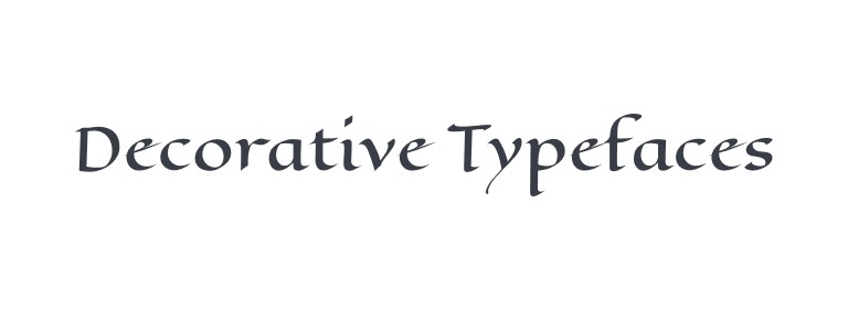
Decorative, or novelty, fonts bring fun and uniqueness to a design. Comic Sans, Chiller, you know the type when you see it.
They suit informal, lighthearted designs, where the typography itself helps set the tone. But like display fonts, use them sparingly. Overuse buries the message. In the right context, though, a decorative typeface adds a quirky edge that nothing else quite replicates.
Best for: holiday cards, themed events, playful branding, or anywhere a formal approach would feel wrong.
Working with type in modern designs
Typography today isn’t about picking a font and calling it done. It’s about crafting an experience. Text is interactive, responsive, dynamic, often working alongside other design elements to deliver something seamless. Done right, typography doesn’t just convey information. It guides the user’s entire journey through your content. So let’s break down how to make typography work for you in modern design.
Hierarchy: direct the user’s focus
In any design, website, app, printed material, doesn’t matter, a clear visual hierarchy is non-negotiable. Visual hierarchy is the arrangement and prioritization of elements to guide the user’s attention. Typography does a lot of that work: vary the size, weight, and style of text, and you’re telling the viewer what matters most at a glance.
- Headlines should dominate, with larger sizes and heavier weights that grab attention immediately.
- Subheadings act as secondary focal points, giving the content structure and breaking it into digestible sections.
- Body text should stay legible and comfortable, with enough contrast to avoid competing with the headline but enough weight to feel stable.
To build that hierarchy in practice: use font size to signal importance (a 36px headline against 16px body text, for instance), lean on different font weights for further differentiation, and use color and contrast strategically. Darker or bolder colors pull focus. Lighter tones recede into the background.
Alignment: keep it structured
Alignment matters more than people give it credit for. Whether you’re arranging text or laying out buttons, consistent alignment builds order and harmony. The three most common approaches:
- Left-aligned text, the easiest to read, and the default across Western design.
- Centered text, often used for formal or dramatic content, though it gets harder to read at length.
- Right-aligned text, which adds visual interest but works best in short bursts, quotes, captions, that kind of thing.
Keep alignment consistent throughout a design, and you reinforce its structure, making it easier to navigate. Misaligned text does the opposite: it reads as disorganized and disrupts the whole experience.
Contrast: differentiate with purpose
Contrast in typography isn’t just about color. It’s about distinguishing text elements from one another so the reader’s attention lands where it should. A bold headline next to regular body text instantly establishes hierarchy. Size does similar work, larger fonts for subheadings and other important elements make them stand out without any extra effort.
Italics, bold, underline, all useful for emphasizing specific points, but only sparingly. Overuse them, and you get clutter instead of clarity. Pair a bold sans-serif heading with a lighter serif body, though, and you get real contrast: each element more distinctive, the whole thing more readable.
Spacing: create breathing room
Give text enough room to breathe. Too little space, and it feels cramped and overwhelming. Too much, and the design feels disjointed. Three spacing elements do most of the work here:
- Line height (leading): the vertical space between lines. Too tight, and reading becomes difficult. Too loose, and lines start to feel disconnected from each other. A good rule of thumb: set line height between 1.4 and 1.6 times the font size.
- Letter-spacing (tracking): the space between all characters in a block of text. Small adjustments can meaningfully improve legibility, especially in all-caps or dense text. Tight tracking feels compact and cohesive; wide tracking feels open and airy.
- Kerning: the space between individual letters. Fine-tune it, and typography looks more visually appealing, with no awkward gaps or crowding between specific letter pairs.
Font size: the Goldilocks rule
Font size isn’t just about what looks good. It’s about usability. On screens, especially in UI, fonts that are too small hurt readability, and fonts that are too large overwhelm the layout. Aim for a minimum of 16px for body text on screens. For headings, find a size that stands out without dwarfing everything beneath it.
And don’t forget responsive typography. On mobile, text needs to adjust to fit the screen without losing readability. CSS media queries let you set different font sizes for different screen resolutions, so your typography stays adaptable and user-friendly across every device.
Best practices for working with typography
Typography isn’t just about aesthetics. It’s about delivering a message effectively. Here’s how to keep your work polished and professional.
Limit font choices: keep it simple, keep it clean
Using too many fonts in a design is like wearing every item in your closet at once. Cool individually, chaotic together. Typography works the same way. Stick to one or two fonts, and get the most out of them, experiment with different weights, styles, and sizes within that family to build contrast and hierarchy. Consistent typography reads as intentional and professional. Too many fonts, and you get visual chaos that distracts from the message. Keep it simple, and let the typography support the content instead of fighting it for attention.
Readability over style: function always wins
It’s tempting to reach for fancy, intricate fonts that look amazing at first glance. But if the text is hard to read, the design has already failed. When choosing fonts, especially for body text, legibility comes first. What’s the point of a beautiful design if the audience can’t actually get through the message?
The best typography doesn’t draw attention to itself. It lets the content be the focus.
Your fonts should enhance the message, never overpower it. If the font is more memorable than the content, style has won over substance, and that’s the wrong trade. Think of typography as the backdrop, not the performance. Use simple, easy-to-read fonts for text-heavy sections, and let the message stay center stage.
Use grids for consistency: structure equals success
Grids aren’t just for aligning images. They’re the backbone that keeps text in line, literally, providing the structural framework for uniform spacing and alignment. That structure is what makes a design feel balanced and readable, whether it’s a web page, a poster, or an app interface.
A grid acts as a guiding system, anchoring typography and every other element around it, creating a cleaner, more organized layout that naturally draws the eye where it needs to go. It also builds consistency: headlines, body text, and captions all fall into a harmonious rhythm in terms of spacing and size. When in doubt, reach for a grid. It’s one of the unsung heroes of effective design.
Responsive typography: adapt to every screen
Typography needs to adapt to different screen sizes, full stop. Responsive typography lets text scale seamlessly across devices, from small phones to large desktop displays, which matters enormously for keeping a design’s integrity and its message intact regardless of where it’s viewed.
Don’t assume typography will look good everywhere. Test it across screen resolutions. What looks balanced on a desktop can look disorganized on a phone, and if a headline runs too large on mobile or body text shrinks too small, the hierarchy and spacing you carefully built falls apart. Prioritize scalability, and the design stays cohesive, readable, and impactful across every platform.
Whitespace is your friend: let your design breathe
Don’t cram too much text into a limited space. Whitespace, negative space, lets typography stand out and speak for itself, instead of feeling overwhelmed or cramped. It improves readability and gives a design a more polished, professional feel. An uncluttered layout naturally draws the eye to the content, improving the whole experience. When in doubt, use a little more space than feels necessary. It almost always pays off.
Bringing it all together
Typography is more than an element of design. It’s a storytelling tool. Used well, type evokes emotion, establishes order, and guides people seamlessly through an experience. Master the balance between hierarchy, contrast, and alignment, and follow the best practices along the way, and your designs won’t just dazzle the eye. They’ll communicate with clarity and impact.
So the next time you sit down to build a design, remember: every letter, every word, every space plays a role in the visual narrative. Executed with intention, typography turns a simple design into something unforgettable, something that actually resonates.
In the next post, we’re diving into the vibrant world of color, how to use it as a design element, its psychological effects, color theory, and how to build harmonious palettes that lift your designs. Get ready to unleash color into your creative arsenal.