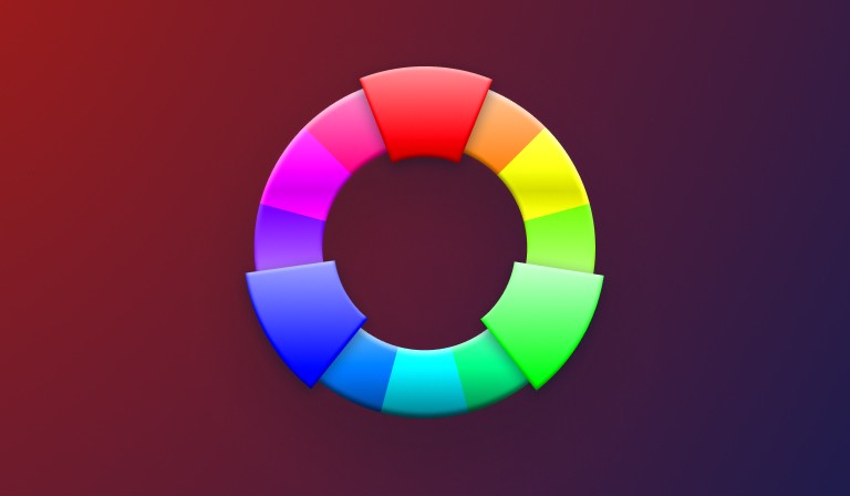
Color gets treated as decoration a lot of the time. Something you sprinkle on at the end, once the layout and the copy and the logic are all locked in. That’s a mistake, and it’s worth saying plainly up front: color is a language, and it’s one your users are fluent in whether they realize it or not. It shapes trust, urgency, calm, and everything in between, often before a single word gets read.
A design without color still functions. It just doesn’t connect. The right hues, shades, and contrasts turn a flat interface into something the eye wants to follow. Color creates emphasis, directs attention, signals importance. It tells a story without needing words to do it.
So how do we actually use it well? We need three things working together: the science of color theory, the psychology of color, and a set of best practices for applying both across real mediums. Every choice, from the harmonies we pick to the contrast ratios we hit, has to serve the experience, not just the mood board.
Why Color Matters in Design
Color isn’t an afterthought. It’s the foundation of how people interpret and interact with what we build. It shapes mood, shapes perception, and establishes brand identity almost instantly. Picture a clean, well-structured website with a dull, mismatched palette. Something feels off, right? That’s color doing its job in reverse, communicating a feeling the layout never intended.
Get the palette right and it builds trust, sparks excitement, or settles the user into calm. It can push urgency into a call to action or wrap a brand in warmth. Whether you’re designing an app, a website, or a logo, color does a lot of the heavy lifting. Mastering it isn’t a bonus skill. It’s the job.
How Color Works: Perception of Color
Color is where science and perception collide. On the surface it looks simple: we look at something, we see its color. Underneath, it’s a lot more interesting. Our eyes contain photoreceptor cells called cones that detect the wavelengths of light bouncing off an object, and our brain translates those wavelengths into what we call color. An apple absorbs most wavelengths of light and reflects red back at us. That’s the whole trick.

But perception adds its own layer of complexity on top. The same red looks different under sunlight than under fluorescent light. Even the colors sitting next to an object change how we read it, something designers call color context. A red beside a blue reads as vivid; the same red beside an orange can look almost muted.
Personal experience compounds it further. We attach colors to memories, cultures, emotions. White reads as purity in most Western design systems and as mourning in several Eastern ones. Neither reading is wrong. They’re just different dialects of the same language.
This mix of hard science and soft subjectivity is exactly what makes color so powerful, and so tricky, in design. You’re not just picking colors that look good. You’re anticipating how an audience, in a specific context, is going to feel them.
Color Meaning and Associations
Now that we understand how color is perceived, let’s get into what it actually communicates. Colors carry psychological weight before a user consciously processes anything else on the page, which is exactly why the selection stage of a project deserves more attention than it usually gets.
What Each Color Tends to Say
Every color has a kind of personality, an emotional shorthand shaped by culture, psychology, and personal history. A few of the load-bearing ones:
- Red: Urgency, alerts, immediate attention. It also signals power and desire, which is why it shows up in bold branding that wants to be noticed rather than trusted.
- Blue: Trust, calm, stability. Tech, finance, and healthcare brands lean on it constantly because it reads as reliable. Light blue feels refreshing; navy adds authority.
- Yellow: Optimism and energy. Great at catching the eye, risky when overused, since it can tip into anxiety or caution instead of warmth.
- Green: Nature, health, growth. Dark green reads grounded and financial; lighter green reads fresh and organic.
- Purple: Luxury, sophistication, a touch of mystery. Creative and spiritual associations make it a strong choice for brands that want to feel imaginative rather than dependable.
Here’s the part that trips people up: these meanings aren’t fixed. Cultural context reshapes them constantly. White signals purity in the West and mourning in parts of the East. Red signals danger in one country and good fortune in China. If you’re designing for a global audience, this isn’t trivia, it’s risk management.
Color Psychology
Color psychology is the study of how colors affect your behavior, mood, and impression on others. Research shows that colors can greatly affect our moods and the way other people respond to us. Amazingly, colors can even change our heart rate, blood pressure, and respiration
Beyond Emotion: Color and Behavior
Color doesn’t just shape how we feel. It shapes what we do. Red in a call-to-action button nudges quick decisions. Blue on a corporate homepage nudges trust. Studies have tied color to appetite, productivity, even spending habits. So it’s worth thinking about color not just as a mood-setter, but as a behavioral lever.
We’ll come back to combinations of these colors in the harmonies section below, since pairing them well is where the emotional and functional impact really compounds. Color is a language. Use it the way you’d use words: deliberately.
Colors, like features, follow the changes of the emotions.
Color Psychology and Cultural Significance
Color psychology tells us colors trigger fairly consistent emotional responses. Red raises heart rates, which is why it works for urgency-driven design like flash sales. Blue calms, which is why it dominates healthcare and corporate branding. Those effects are close to universal. Layer culture on top, though, and the meanings start to diverge sharply.
Cultural Contexts of Color
Take red as the clearest example. Its meaning shifts depending on where your audience is standing:
- In China, red signals good luck, prosperity, and joy, worn and displayed at weddings and festivals.
- In most Western cultures, red leans toward danger and warning: stop signs, fire trucks, emergency alerts.
- In parts of South Asia, red is tied to purity and fertility, a traditional bridal color rather than a warning one.
White tells a similarly split story. In the West it’s purity, weddings, minimalism. In many Eastern cultures it’s mourning and the afterlife, which makes it a genuinely risky default for a celebratory design.
Even black and yellow aren’t safe from this. Black reads as elegant and formal in Western luxury branding, but signals grief elsewhere. Yellow, usually warmth and positivity, can read as caution or even deceit depending on the region.
Designing for a Global Audience
If you’re building for a global audience, none of this is optional homework. A palette that works perfectly in the U.S. can misfire badly somewhere else. Research your audience. Understand the cultural weight of the colors you’re choosing. Test across regions, or bring in local reviewers, before you commit a palette to production.
Color is a power which directly influences the soul.
Get color psychology and cultural context right together, and your designs stop being merely attractive. They start being resonant.
Color Theory: The Science of Harmony
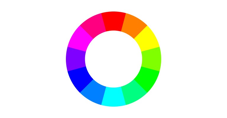
The color wheel dates back to Sir Isaac Newton, who first organized colors into a circle in 1666 to show how hues relate to one another. It splits into primary colors (red, blue, yellow), secondary colors (green, orange, purple), and tertiary colors (red-orange, blue-green, and so on) built by mixing the two. Think of it less as a chart and more as a map, one that shows you which combinations, or color harmonies, are going to feel intentional rather than accidental.
Understanding Color Harmonies
A color harmony is just a combination that reads as balanced to the eye. Learning to build these is one of the most transferable skills in design, on par with learning chord progressions in music: a handful of relationships, reused endlessly, still feel fresh in the right hands.
Complementary Colors
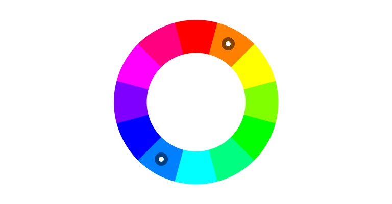
Colors sitting directly opposite each other on the wheel, like red and green, or blue and orange. High contrast, high impact. Perfect for anything that needs to visually pop, like a button or a critical alert.
Analogous Colors
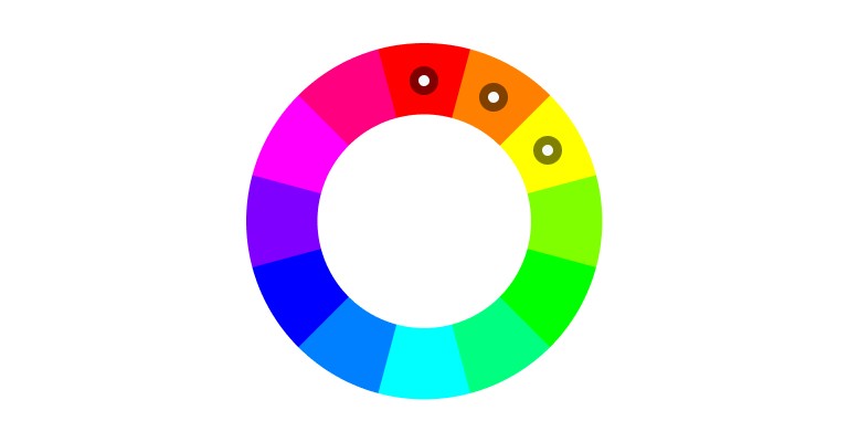
Colors sitting next to each other, like blue, teal, green. These feel natural because they share a base wavelength range. Calming, unified, and a strong default for backgrounds or long, continuous sections.
Triadic Colors
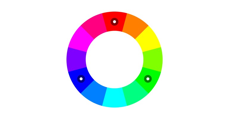
Three colors evenly spaced around the wheel, like red, yellow, blue. This is the harmony that balances contrast against cohesion. Vibrant without falling apart. Good for anything that needs energy but can’t afford chaos.
Split-Complementary Colors
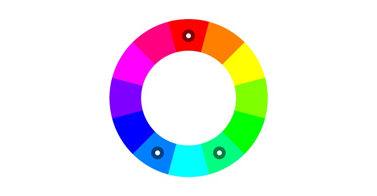
A softened complementary scheme: take a base color and pair it with the two colors adjacent to its complement, rather than the complement itself. Blue paired with yellow-orange and red-orange instead of straight orange. Contrast, minus the tension.
Monochromatic Colors
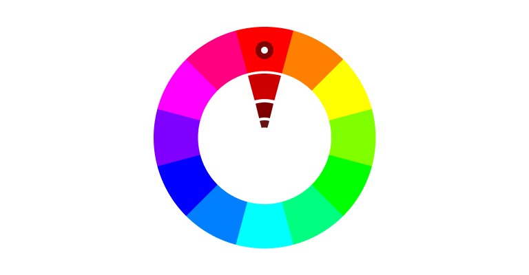
Shades, tints, and tones of a single hue. Highly cohesive, minimal, elegant. It’s a favorite in UI design specifically because it keeps focus tight, though it takes real skill to avoid tipping into visual monotony.
Tetradic Colors
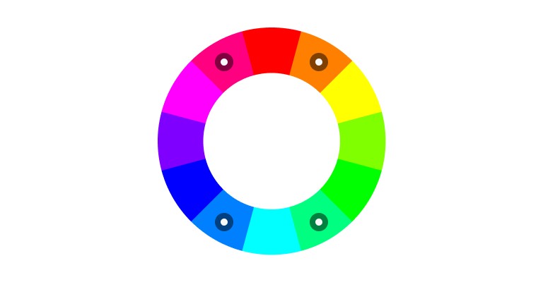
Two complementary pairs at once, like red and green combined with blue and orange. Rich, vibrant, and genuinely hard to balance. Let one color lead and use the rest as accents, or the palette will fight itself.
Why the Color Wheel Still Matters
The color wheel isn’t just an artist’s tool sitting in a drawer somewhere. It’s core infrastructure for a designer’s thinking. Complementary pairs draw the eye to what matters. Analogous or monochromatic schemes settle it into calm. Mastering these harmonies means your palette isn’t just pretty, it’s doing communicative work.
A Glimpse Into Color Theory’s Roots
Newton’s wheel was just the start. Johann Wolfgang von Goethe picked up the thread by studying how color shapes emotion and mood, laying groundwork for what we now call color psychology. Later, Michel Eugène Chevreul formalized the theory of simultaneous contrast, explaining why the eye perceives the same color differently depending on what surrounds it.
Between them, they gave designers something valuable: proof that color isn’t just decoration layered on top of art. It’s a discipline with its own internal logic, one part science, one part psychology.
Color Modes: Additive and Subtractive
Two fundamental processes sit underneath every color decision we make: additive and subtractive color. Screens use one. Print uses the other. Confuse them, and your colors will betray you the moment they leave the screen.
Additive Color: RGB
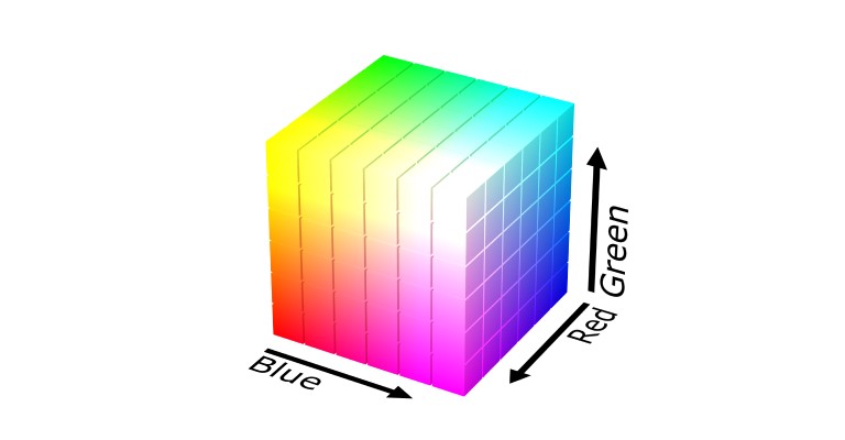
Screens build color by adding light. Start with black, then mix red, green, and blue light at different intensities, the RGB color model. More light means more color; all three at full intensity gives you white, none at all gives you black. That’s why it’s called additive.
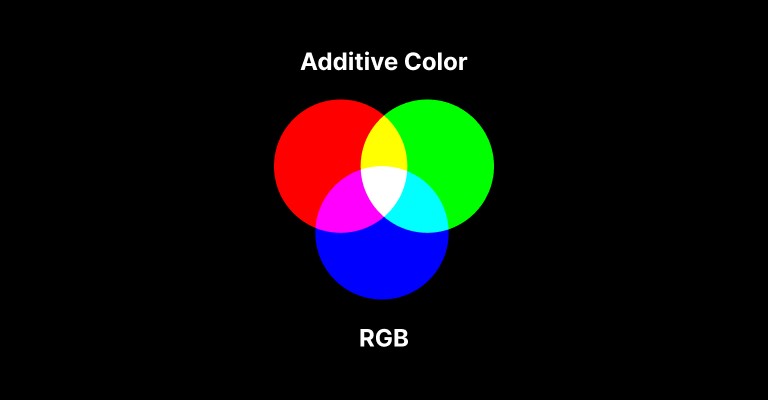
A few combinations worth knowing:
- Red + Green = Yellow
- Red + Blue = Magenta
- Green + Blue = Cyan
Subtractive Color: CMYK
Print works the opposite way. Instead of emitting light, ink absorbs it, starting from a white surface and subtracting wavelengths until what’s left is the color you see. This is the CMYK model: cyan, magenta, yellow, and black ink.
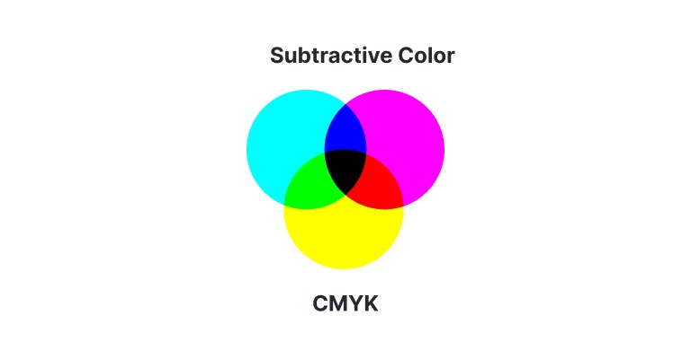
A cyan pigment absorbs red light and reflects green and blue back at you, which is why it reads as cyan. In the subtractive world:
- Cyan + Magenta = Blue
- Magenta + Yellow = Red
- Cyan + Yellow = Green
In theory, combining all three at full saturation produces black. In practice, it produces a muddy brown, which is exactly why the “K” (black) gets added as its own channel, giving print its deep, clean blacks.
In nature, light creates the color. In the picture, color creates the light.
Why Color Modes Matter
RGB for screens, CMYK for print. Simple rule, easy to forget. A neon blue that looks electric on a screen almost always goes flat and muted the moment it’s printed, because print physically can’t reproduce the intensity of emitted light. Get the mode wrong and you’ll spend a print run wondering why nothing matches your mockup.
Components of Color: Hue, Shade, Tint, and Tone
Four building blocks do most of the work in a color palette. Learn to manipulate them and you can dial a design’s mood up or down without ever touching layout.
Hue
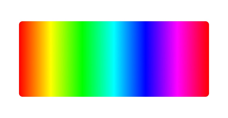
Hue is color in its purest form, red, blue, green, yellow, each defined by its own wavelength. It’s the foundation everything else builds on. A bright red hue signals urgency or excitement; a calm blue signals trust. Pick the hue first, and the rest of the palette follows from it.
Shade

Add black to a hue and you get a shade, darker, deeper, often more sophisticated. A burgundy shade of red can feel luxurious or cozy in a way pure red never could. Shades add depth and guide emotional weight without changing the underlying hue.
Tint

Add white instead, and you get a tint, lighter, airier, generally read as optimistic. A pastel blue tint reads as tranquility, which is exactly why wellness and lifestyle brands lean on tints so heavily. Tints make a design feel open and approachable.
Tone

Add gray, and you get a tone, muted, subdued, versatile. Tones read as sophisticated and professional, which makes them a strong default for corporate or minimalist work. A toned-down green feels stable rather than loud, useful for anything sustainability- or health-adjacent.
Hue sets the direction. Shade deepens it. Tint lightens it. Tone tempers it. Master all four and a single color choice stops being one decision and starts being a whole spectrum of options.
Color Spaces and Color Models
Two frameworks govern how color actually gets represented in a digital pipeline: color spaces and color models. Confusing the two is common, and it’s worth being precise about the difference.
Color Spaces
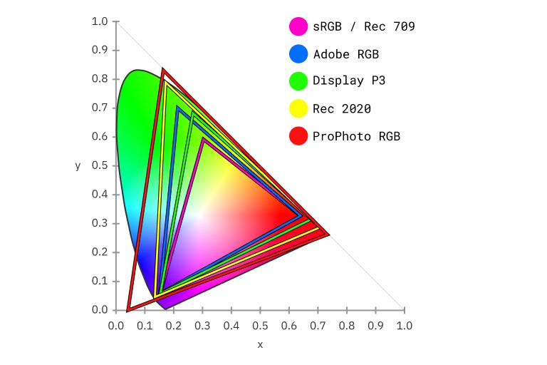
- sRGB: The internet’s default. Consistent across most digital displays, which makes it the safe choice for web design.
- Adobe RGB: A wider range, especially in cyans and greens. Standard in professional photography and print, where accuracy matters more than universal compatibility.
- Display P3: Built for digital cinema and modern devices, with a noticeably wider gamut than sRGB. Vibrant, saturated, and now the default capture space on most current phone cameras.
- Rec. 2020 (BT.2020): The broadest of the group, built for high and ultra-high-definition video. Still ahead of most consumer hardware, but that’s the point of a future-proof standard.
Color Models
- RGB: The standard additive model for screens. Combines red, green, and blue light at varying intensities.
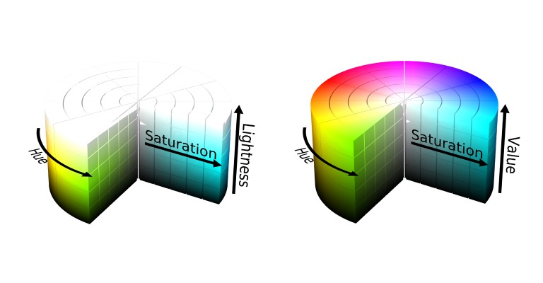
- HSL / HSV: Organizes color by hue, saturation, and lightness or value. Intuitive to adjust by hand, which is why most color pickers default to it.
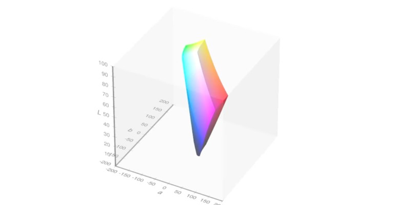
- LAB (CIE Lab*): Modeled on human vision, consistent across devices. Splits color into lightness, green-red position, and blue-yellow position. The go-to for precise color correction.
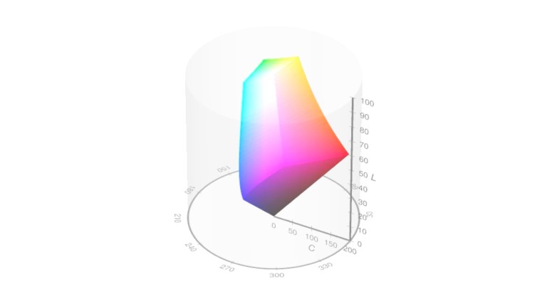
- LCH: The polar (cylindrical) version of LAB, adjusting luminance, chroma, and hue independently and intuitively.
- OKLAB / OKLCH: The newer generation, built for better perceptual uniformity than LAB or LCH. Equal numeric steps in OKLCH actually look like equal visual steps, which older models never quite delivered.

This one’s worth flagging as a real update since this was first written: OKLCH has gone from an interesting spec to a genuinely production-ready tool. It’s supported in every major evergreen browser (Chrome, Safari, Firefox, Edge) and covers upwards of 90% of users today, and it’s now the default color space in tools like Tailwind CSS v4. If you’re building a design system in 2026, authoring your tokens in OKLCH with an sRGB fallback is a reasonable default, not a bleeding-edge experiment.
Choosing the Right Framework
For screen work, stick with RGB or HSL inside the sRGB space, or OKLCH if your tooling supports it. For anything requiring precise correction or a print handoff, LAB, LCH, or OKLCH will serve you better. Pick the framework that matches where the work is actually going to live.
Color Gamut: Understanding the Range of Colors
A color gamut is the range of colors a given space or device can actually reproduce, usually visualized as a 2D or 3D map. sRGB’s gamut is narrower than Adobe RGB’s, which is exactly why Adobe RGB can hit more saturated colors, and exactly why you should still default to sRGB for anything shipping to the general web.
What Shapes a Gamut
- Color space: sRGB is sufficient for the web; Adobe RGB suits print, where the wider range actually gets used.
- Device calibration: Every monitor, phone, and printer interprets color slightly differently. A color that pops on one screen can go flat on another.
- Lighting conditions: Natural light and artificial light render the same color differently, so the viewing environment is part of the design brief whether you planned for it or not.
Why Gamut Awareness Pays Off
Three things follow directly from understanding your gamut: consistency across devices and media, creativity within known constraints instead of guessing blind, and accessibility for users with color vision deficiencies. All three compound if you get the fundamentals right early.
Making the Most of It
- Match the space to the project. sRGB for digital, Adobe RGB or CMYK for print.
- Test across real devices. Don’t trust a single monitor’s rendering.
- Embed color profiles in tools like Photoshop or Illustrator to keep accuracy consistent through the whole pipeline.
Color Contrast: Accessibility Matters
Contrast isn’t an aesthetic nice-to-have. It’s the difference between content that’s usable and content that quietly excludes people. Good contrast lets text and key elements stand out clearly, which matters for every user and is non-negotiable for users with visual impairments.
The Importance of Contrast
Low contrast makes text and interactive elements hard to parse, especially for people with color vision deficiencies or low vision. Prioritizing contrast isn’t a compliance checkbox, it’s a straightforward way to make a design work for more people.
Where the Standards Actually Stand
This is worth updating, since the standards landscape has shifted since this piece was first written. WCAG 2.2 is the current, legally operative accessibility standard: 4.5:1 contrast for normal text, 3:1 for large text (18pt or larger).
Web Content Accessibility Guidelines (WCAG)
These guidelines specify minimum contrast ratios that should be met for text and visual elements. For normal text, a contrast ratio of at least 4.5:1 is recommended, while large text (18pt or larger) requires a minimum ratio of 3:1. These ratios ensure that content remains legible against various backgrounds.
APCA (the Advanced Perceptual Contrast Algorithm) is often talked about as the next standard, and it’s a genuinely more perceptually accurate model, factoring in font size, weight, and polarity rather than a single flat ratio. But it’s important to be precise here: APCA was pulled from the formal WCAG 3 working draft back in 2023 as exploratory content, and as of 2026 it’s still not an adopted standard. WCAG 3 itself remains a working draft, with a final recommendation not expected before 2028. So the practical guidance is this: use APCA if you find it useful for your own judgment calls, but don’t treat it as a compliance requirement, and keep your actual color pairs conforming to WCAG 2.2 in the meantime.
Advanced Perceptual Contrast Algorithm (APCA)
The APCA takes a more nuanced approach by considering human perception of contrast, providing more accurate and adaptive guidelines for designers. It aims to enhance readability for all users, particularly those with color vision deficiencies, by recommending specific contrast ratios based on the colors used.
Putting Contrast Into Practice
- Check text against background using a contrast checker, every time, not just when something looks borderline.
- Test color combinations against simulated color-blindness to catch what your own eyes might miss.
- Use contrast to build hierarchy, not just legibility. Buttons and headings should stand out on purpose.
- Test with real users, especially those with visual impairments, and treat their feedback as a design input, not an afterthought.
Atmos: Contrast checker
Check WCAG 2 and APCA contrast between colors in HEX, RGB, HSL, and LCH.
Putting Color Theory Into Practice
Understanding the theory is one thing. Shipping it is another. Here’s how we actually apply it.
Principle #1: Build a Clear Color Hierarchy
- Emphasize key elements. Bold, saturated colors for calls to action, headlines, alerts, anything that needs the eye first. A bright orange button against a neutral background isn’t subtle, and it isn’t supposed to be.
- Keep secondary elements muted. Give primary actions room to breathe by not letting supporting colors compete for attention.
- Stay consistent. Red for errors, green for success, every time. Once users learn the code, they stop needing to read every word.
Principle #2: Choose the Right Harmony
- Analogous for a calm, unified feel.
- Complementary for striking contrast and energy.
- Triadic for vibrancy that stays balanced rather than chaotic.
Principle #3: Prioritize Contrast and Readability
- Check text-to-background contrast against WCAG 2.2, every time.
- Increase size and weight for legibility, especially in body text.
- Cap yourself at two to three colors per text block. More than that, and clarity suffers.
Principle #4: Design for Dark Mode Properly
Dark mode isn’t just “invert the palette.” Reassess contrast on dark backgrounds specifically, since bright colors intensify against black in ways they don’t against white. Lean on slightly muted tints and shades to avoid visual strain, and test in both modes with real users before calling it done.
Best Practices for Color in Design
- Test across devices. Colors shift across screens, and shift again in print. Check both before you ship.
- Keep the palette small. Three to five colors, each with a purpose. Decoration for its own sake just adds noise.
- Use contrast with intent. It’s not just about passing a checker, it’s about building a visual hierarchy that guides the eye.
- Design for accessibility from the start. Run real contrast checks, and never rely on color alone to convey information. Pair it with labels or patterns so the message survives even if the color doesn’t land.
Conclusion: The Power of Color in Design
Color was never just decoration. It shapes perception, drives emotion, and defines how an experience actually feels to use. Get it right and a design goes from functional to memorable.
Every color carries meaning. Choose deliberately, and you build a real connection with the people using what you make. Stay current, because color standards and tooling keep moving (see: OKLCH going from niche to default in three years). And don’t be afraid to experiment. Push a palette further than feels comfortable, test it, and let the results tell you if you were right.
Color is subjective enough that feedback matters more than instinct alone. Get it in front of real users, gather real reactions, and let that shape the next version.
In the end, color is a vital element that can make or break a design. Understand the science, the psychology, and the practice, and you’re equipped to build experiences that are compelling, inclusive, and genuinely memorable. The next time you sit down to design, remember: it’s not just about what looks good. It’s about crafting a visual narrative that speaks to your audience and drives your message home.
More on the fundamentals of visual communication is coming in future posts, so stay tuned.