Welcome back. Now that we’ve covered the essential elements of design, it’s time to shift gears and look at the principles that guide how we actually use those elements. Design isn’t just about the individual pieces we put together. It’s about how those pieces interact to form a cohesive whole. Think of design principles as the framework that helps us bring a creative vision to life while keeping the result both functional and visually appealing.
Design principles give us a set of guidelines that inform our choices, letting us make intentional decisions that enhance the overall user experience. Whether we’re designing a website, a logo, or a piece of marketing material, understanding these principles empowers us to create work that not only looks great but communicates clearly.
Master these principles, and we elevate the work. Our designs resonate with the audience, and the message actually lands instead of getting lost. So let’s dive into the key principles of design and see how they shape the creative process, and the outcomes we get from it.
Why principles matter
Design isn’t about throwing a few elements together and calling it a day. It’s an art and a science, and it demands thoughtful consideration and intention. It’s about creating a cohesive experience that resonates with an audience and communicates a message effectively. Done right, design engages, informs, and even persuades.
The principles of design serve as a roadmap on this journey. They give us the guidelines we need to make informed decisions about how to arrange elements on a page, balance visual weight, and guide the viewer’s eye in a purposeful direction. Each principle is a tool in the design toolbox, letting us manipulate elements in ways that enhance both usability and visual appeal.
Take balance, for instance. Understanding it helps us distribute visual weight so no part of a design feels heavy or overwhelming. Emphasis lets us highlight key messages, so the audience knows exactly where to look. Grasp these principles, and our designs don’t just look good. They function well, creating a seamless experience for the people actually using them.
And the impact compounds. Apply these principles well, and we create designs that are not just aesthetically pleasing but effective, fulfilling whatever purpose they were built for in the first place. In a world drowning in visual content, a strong grasp of design principles is what sets our work apart and makes it memorable.
The key principles of design
Let’s break down the principles every designer should carry with them.
Balance
Balance is about distributing visual weight across a design so no single element overwhelms the others. It’s a crucial principle, and it’s what gives a composition its overall harmony. Get it right, and you create a sense of stability and order, which makes it easier for viewers to navigate the design and take in what’s actually there.
We achieve balance in two main ways:
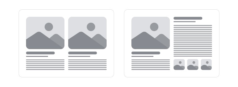
- Symmetrical balance: elements arranged evenly on either side of a central axis. Picture a perfectly balanced scale, it feels stable and harmonious. Symmetrical designs tend to convey formality and tradition, which is why they show up so often in branding, logos, and professional layouts. This kind of balance is visually appealing precisely because it’s predictable. Viewers process the information without distraction.
- Asymmetrical balance: elements of different sizes, shapes, and visual weights arranged in a way that still feels balanced. This creates more dynamic, interesting layouts, with a real sense of movement and energy. Asymmetrical designs pull the viewer’s attention in multiple directions, making the experience more engaging. It tends to read as modern and spontaneous, and it works well for creative projects where breaking convention is the whole point.
Balance your design well, and you enhance its overall impact. A well-balanced layout doesn’t just feel more organized and polished. It guides the eye and improves comprehension. Symmetrical or asymmetrical, the goal is the same: a composition that feels cohesive and intentional, so the message actually shines through.
Pattern

Pattern is repetition, and it’s a surprisingly powerful tool for building visual interest and cohesion. Bring in recurring elements, shapes, colors, textures, imagery, and you create a rhythm that guides the eye and establishes unity across the whole composition. Patterns can evoke specific feelings or associations, shaping how an audience perceives the message and the brand behind it.
Think about how skillfully brands use pattern in their marketing. The recognizable motifs that show up everywhere from the wallpaper in a retail space to the graphics on a website, that’s not decoration for its own sake. Those consistent elements reinforce brand identity and make the overall design stick in memory.
But here’s the catch: pattern needs balance too. Repetition creates harmony, sure, but too much of it overwhelms the viewer and buries the message. An overly busy design creates confusion, and the audience loses track of what actually matters. Too few repeated elements, on the other hand, and the design feels disjointed, lacking any real coherence.
So use pattern thoughtfully and with purpose. Aim for repetition that enhances the composition rather than distracting from it. Consider carefully how and where to bring patterns in, and you end up with a design that feels cohesive and engaging while still communicating clearly.
Emphasis
Emphasis highlights the most important parts of a design, making sure key messages and elements actually stand out. Create focal points, and you guide the viewer’s attention to what matters most, making the information easier to absorb and act on.

We achieve emphasis through size, color, contrast, and placement. A large, bold headline naturally draws the eye more than smaller text does. That makes it an effective way to communicate the main idea right from the start. Contrasting colors do similar work, making certain elements pop against the background and pulling attention exactly where we want it.
What do we want the audience to remember or act on? A call to action, an important fact, a unique selling point? Apply emphasis strategically around that answer, and viewers won’t get lost in a sea of competing information.
But watch the ceiling here. Too much emphasis is counterproductive. Treat every element as a focal point, and you get chaos instead of clarity. Prioritize the key messages instead, and use emphasis selectively to build a clear hierarchy, one that lets the audience navigate the design with ease.
Movement

Movement guides the viewer’s eye through a design, creating a visual flow that leads them from one part of the composition to the next. It’s the dynamic quality that makes a design feel alive, directing attention across various elements in a deliberate sequence.
We create movement through lines, shapes, colors, and even the arrangement of text. Diagonal lines create a sense of action. Curves lead the eye more gently, more fluidly. Contrasting colors act as visual cues, steering attention toward specific areas of interest.
So what story does the layout tell? A well-structured design takes the viewer on a journey, making the content easy to digest and the narrative easy to follow. A series of images, a flowchart, a webpage, it doesn’t matter the format. Effective movement improves understanding and retention by mirroring how we naturally scan and absorb information in the first place.
Proportion

Proportion is the relationship in size between different elements in a design. Get it right, and elements create a sense of harmony and balance that lifts the whole composition. You’ve probably heard of the “golden ratio,” the mathematical proportion that shows up again and again in nature and art. But proportion is really just about how elements relate to each other in scale, golden ratio or not.
Use proportion well, and you emphasize the elements that matter and build a more visually appealing composition. A large image next to smaller text draws attention to the image, while the text still supports it instead of competing for the same attention. That kind of thoughtful arrangement keeps any single element from overwhelming the rest, contributing to a more cohesive, well-structured design.
Proportion also shapes how a viewer perceives the design as a whole. Elements that are too large or too small relative to each other create visual discord and, eventually, confusion. Well-considered proportions do the opposite: they establish a clear hierarchy, so viewers can navigate the content and understand how the pieces relate to one another.
Bringing it all together
As you dive into your own design projects, keep these principles close. They’re not strict rules. They’re flexible guidelines that help us create more effective, more engaging designs. Think of them as tools in the creative toolkit, each one serving a distinct purpose. Understanding how they function individually, and how they work together, is what actually elevates the work.
Don’t be afraid to experiment. Every designer has their own flair, and what works for one won’t necessarily work for another. Give yourself the freedom to play with these principles, mix and match, tweak and refine, until you land on something that feels right. That’s the beauty of design: it’s subjective. Sometimes breaking the rules is exactly what leads to the most innovative, unexpected results.
Design is as much about intuition as it is about structure. Trust your instincts. Don’t be afraid to challenge convention when it serves the vision. Some of the most iconic designs in history came from a willingness to experiment and take risks.
In the next post, we’ll shift focus to typography, exploring how the right type choices elevate the work and communicate the message more effectively. Typography is a critical element of visual design that often gets overlooked. Get ready to dive into fonts, styles, and text arrangement.