Introduction
In digital product design, creating a seamless experience for users is the whole game. That’s where design systems come in as a toolkit that brings designers and developers together, keeps things consistent, and makes the entire process smoother. So what’s the deal with design systems, and why should we care? Let’s dive in.
What’s a design system, anyway?
A design system is a systematic approach to creating and maintaining designs. That covers everything from reusing styles and elements for consistency to building out a full framework of UI kits and development environments. Whether it’s a lightweight set of guidelines or a full-fledged toolkit, a design system streamlines the design process, keeping every part of a product cohesive and user-friendly.
Think of it as a well-organized collection of everything we need to build great digital products: reusable components, guidelines, and standards that keep the whole team aligned and on the same page. It’s a shared language that bridges the gap between designers and developers, letting everyone work together seamlessly on branding and user experience.
A design system isn’t just a collection of components. It’s a way to unify a team around a common visual language, fostering collaboration and consistency.
A brief history of design systems
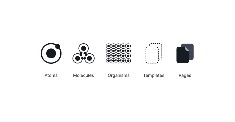
Design systems didn’t appear out of nowhere. They evolved as designers ran into the hard problem of creating cohesive experiences across multiple products. A pivotal moment came in 2013, when Brad Frost introduced Atomic Design. He broke design down into five levels, atoms, molecules, organisms, templates, and pages, giving teams a systematic way to build user interfaces. This didn’t just help teams organize their design elements. It made the entire process more scalable and reusable.
Atomic Design by Brad Frost
Learn how to create and maintain digital design systems, allowing your team to roll out higher quality, more consistent UIs faster than ever before.
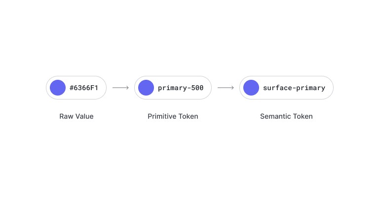
Not long after, Jina Anne and Jon Levine brought attention to design tokens. Their work focused on standardizing design variables like colors and spacing, making it easier to keep things consistent across platforms. With design tokens, teams could make updates in one central location, and the change would ripple through every related project automatically. That was a genuine turning point for design systems, it streamlined the update process and kept everything aligned without the manual chasing.
Using Design Tokens with the Lightning Design System
Design Tokens are the basic atoms of the Lightning Design System. Learn what they are, how they help us maintain and scale our design language across multiple platforms and devices, best practices, and how to use them to apply branding customization.
Two major players shaped where design systems went from there: Google’s Material Design and Bootstrap CSS. Material Design, launched in 2014, introduced guidelines that prioritize clean, intuitive interfaces with a real focus on motion and interaction. It pairs aesthetics with function, making it easier to build experiences that are both visually appealing and usable. Bootstrap, around since 2011, gave developers a responsive grid system, pre-styled components, and JavaScript plugins, letting them build responsive websites fast. Both frameworks shaped how we structure and implement design systems today, and both remain solid reference points for reusable components and consistent styling.
Material Design
We challenged ourselves to create a visual language for our users that synthesizes the classic principles of good design with the innovation and possibility of technology and science.
Bootstrap CSS
Powerful, extensible, and feature-packed frontend toolkit. Build and customize with Sass, utilize prebuilt grid system and components, and bring projects to life with powerful JavaScript plugins.
The heart of a design system
At the core of any design system is a style guide. This is where the visual stuff lives: colors, typography, icons, imagery. It establishes a consistent brand identity, so users recognize a product no matter where they encounter it.
Next up is the component library. Think of it as a treasure chest of reusable UI elements, buttons, forms, modals, and so on. These components are building blocks that let us assemble interfaces quickly, without starting from scratch every time. Designers get to focus on creativity, and developers get to implement designs without endless back-and-forth.
Then there are design tokens. Sounds fancy, but it’s really just a clever way to standardize things like colors and spacing. Want to change a shade of blue? Change it in one place, and it updates automatically everywhere that color shows up. Genuinely one of the more satisfying parts of a well-built system.
Don’t forget guidelines and best practices. This is where we cover how to actually use the components and styles well, accessibility, so everyone can use the product, and responsiveness, so it holds up across devices. These guidelines are what keep a product functional and user-friendly, not just pretty.
Finally, there’s documentation. Good docs are the unsung hero here. They explain how to use the design system, with tips, code snippets, and examples, so anyone can jump in and get moving without feeling lost.
A design system isn’t just a collection of components. It’s a way to unify a team around a common visual language, fostering collaboration and consistency.
Why bother with a design system?
You might be wondering: what’s the big deal? Here’s the short version. A design system in place means the team works more efficiently. Everyone’s pulling from the same components and guidelines, which keeps things consistent. Users notice the smooth, recognizable experience across platforms, and that consistency is exactly what builds trust.
When changes need to happen, updating a brand color, tweaking a button, a design system makes that a non-event. Make the change in one spot, and it’s updated everywhere. That matters even more at scale: a change the design team makes can propagate to web, mobile, and every related project at once. No more chasing down every instance of an element across a dozen different places.
Design systems also make collaboration genuinely better. Designers and developers communicate more clearly, which cuts down on miscommunication and misunderstanding. It fosters real teamwork, where everyone has a hand in the product’s design and functionality.
Wrapping it up
Design systems are a genuine game-changer in digital product design. They bring structure and consistency, letting a team build beautiful, functional, scalable products without the chaos. Adopt a design system, and you’re not just improving your own workflow. You’re improving the experience for everyone who actually uses what you build.