Let’s start at the foundation, before we get into the more advanced design concepts and methodologies in future posts. Think of this as our entry point.
It’s easy to jump straight into design. Learn your way around the software, and you can call yourself a designer pretty fast. But mastering a tool doesn’t automatically make you a great designer. To actually excel, we need to understand the core elements that make a design a design, not just a file that opens correctly. Some of us didn’t pick up on the fundamentals early on. That’s fine. You’ll eventually feel the gap as you gain more experience, and this is where you go to close it.
What are the elements of design?
The elements of design are the building blocks of any visual creation. Think of them as ingredients in a recipe, the core components we need to make something that not only looks good but actually communicates. These elements are shape, color, space, form, line, value, and texture. Each one plays a distinct role in shaping the overall look and feel of a design.
But designers don’t use these elements just to make things pretty. We use them to set a mood, draw attention to certain areas, and evoke emotion. Picture walking into a room where the colors, textures, and layout make you feel calm, energized, or curious before you’ve consciously registered why. That’s the elements at work, quietly doing their job.
The elements of design
There’s a lot to weigh when you’re creating any visual piece, whether it’s a website, a logo, a poster, or the layout of a room. Every element you choose shapes how the final design gets perceived and experienced. It’s not just about making something look good, though that matters. It’s about creating something that resonates, communicates a message, and evokes a feeling.
Whether you’re designing an app, building out a brand’s visual identity, or arranging a living room, the basic elements of design are the foundation you keep coming back to. They’re your toolkit, your go-to resources for shaping something meaningful. So let’s break them down.
Color
Color is one of the most powerful tools in a designer’s kit. It sets the mood and shapes how people feel about what they’re looking at, instantly and without a single word. What we perceive as color happens when light reflects off an object and hits our eyes, but in design it’s so much more than a physics lesson.
We use color to communicate mood, add depth, and establish perspective, not just to make things look pretty. By leaning on color theory, the rules and guidelines that govern how colors work together, we can build harmonious color schemes that make a design feel cohesive and intentional. Combine complementary colors for contrast. Use analogous colors for something softer and more unified. Understanding how colors interact is essential for any designer, full stop.
And color isn’t about personal preference. It shapes the entire narrative of a design. Notice how certain brands stick to a specific palette religiously? That’s not an accident. Color conveys identity, values, and the audience a brand is trying to reach.
We’ll dig deeper into color in a future post, covering color psychology, how to build effective palettes, and the impact of different color combinations. Stay tuned for that.
Line
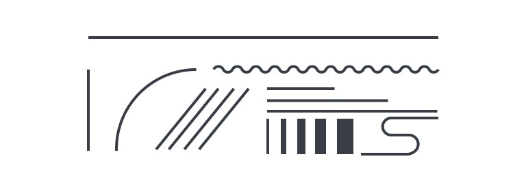
Lines guide the viewer’s eye and create a sense of movement. Horizontal, vertical, diagonal, the direction alone shifts the entire feel of a design. Thickness, texture, and curvature matter too, pushing a design toward calm and stability or toward energy and excitement. Curved lines feel organic and fluid. Jagged or zigzag lines feel chaotic, even urgent. Lines can also suggest texture or depth on their own. They’re deceptively simple and enormously versatile: a handful of strokes can structure a whole layout and carry an emotional charge at the same time.
Value
Value refers to the lightness or darkness of a color, and it does a lot of heavy lifting for depth and dimension. A smooth gradient from light to dark is value in action. It defines shapes, suggests volume, and creates contrast that guides the eye.
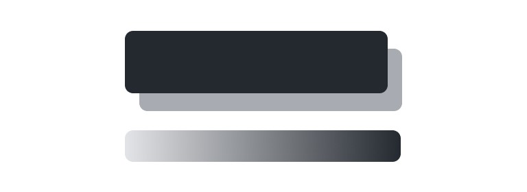
We use value to give a design a sense of depth, mass, and volume. Manipulate lighter and darker shades of the same color, and a flat design suddenly reads as three-dimensional. Add darker values to one side of an object and lighter values to the other, and you’ve implied a light source. The object stops looking flat and starts looking substantial.
Value isn’t only for realism, either. High contrast between light and dark pulls the eye to specific areas. Lower contrast softens everything into a more harmonious feel. Same tool, opposite effects, depending on how you turn the dial.
Space
Space is one of the most underrated elements in design. It’s not about filling up a page or screen. It’s about knowing when to leave it alone. This is where white space, or negative space, comes in: the empty area surrounding design elements, where nothing appears to be happening but a lot actually is.
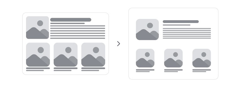
White space lets the eye rest and directs focus to the parts of the design that actually matter. It makes a design feel open, clean, and uncluttered, which is especially important in websites and apps where readability and navigation are everything.
Then there’s positive space, where the actual elements live: text, images, buttons, and so on. Design is a balancing act between the two. Too much positive space and you get clutter, overwhelming the viewer. Too much negative space and the design feels empty or unfinished. Neither extreme works.
“Effective use of space makes a design feel intentional, clear, and easy to interact with.”
We’ll cover techniques for using space effectively in a future post, especially for building balanced, user-friendly designs.
Shape
Shapes are two-dimensional areas defined by an outline, and they’re fundamental building blocks for structuring and organizing a visual. Squares, circles, or something far more complex, shapes create patterns and define boundaries.
We enhance shapes with line, color, and shadow to give them a three-dimensional feel, making a flat shape appear to pop off the page or screen. Shading and gradients can turn a plain circle into a sphere with real mass and volume.
Shapes fall into three main types:
- Organic shapes: natural, free-flowing forms like leaves or clouds. They feel fluid and relaxed.
- Geometric shapes: precise forms like triangles, squares, and circles. They feel rigid and consistent, bringing order and stability to a design.
- Abstract shapes: simplified representations of real things, like icons or symbols. Not perfect recreations, but recognizable enough to convey an idea.
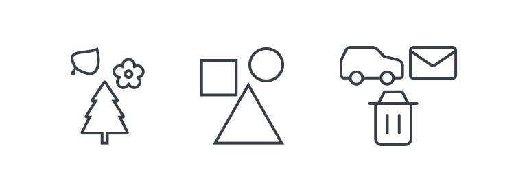
Shapes show up everywhere in design, from a tiny icon to the overall layout of a page. Understanding how to use, combine, and manipulate them shapes the clarity and flow of everything you build.
Form
Form is how a shape occupies space, but it goes further by introducing a third dimension. Shape is typically two-dimensional. Form adds depth, making an object feel like it exists in the real world, even when it’s sitting on a flat screen or page. The contrast between a circle and a sphere is form in a nutshell: one is flat, the other has volume and dimension.
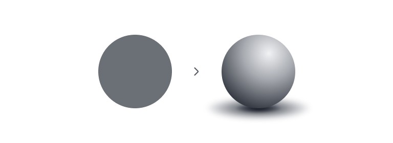
Designers work in two dimensions, but we fake the third one constantly, using shading, contouring, and light. Skillful highlights and shadows can turn a flat shape three-dimensional almost instantly. We also lean on how objects overlap and interact with one another to reinforce a sense of depth and space.
Form brings realism to a design, or simply gives it more weight and presence. Manipulate how light hits an object, or how shadows fall, and the whole thing feels more dynamic, even while stuck on a flat surface.
Texture
Texture is about how things feel, whether that’s through touch or purely through sight. It adds depth and interest, letting viewers imagine the tactile sensation of a surface they’ll never actually touch. Good designers are skilled at faking that sensation, making surfaces read as rough, smooth, gritty, or soft on a screen.
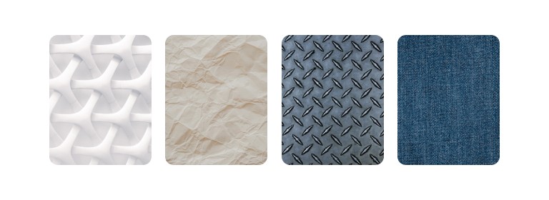
There are two main types of texture worth knowing:
- Tactile texture: the physical feel of a surface, like sandpaper, velvet, or glass. These textures engage our sense of touch directly and can evoke specific feelings or memories.
- Visual texture: how texture is represented in a design, without any physical surface to back it up. It’s the illusion of texture through images, patterns, or techniques that suggest a particular feel, like making a flat graphic look like it’s made of fabric or stone.
Incorporating texture into a design adds layers of interest and makes it more engaging. Done well, it strengthens the storytelling in a piece, helping convey mood or context without a word of copy.
Elements vs. principles of design
The elements of design are the fundamental building blocks of any visual piece, but the principles are what tell us how to use them well. Think of the principles as the guiding rules for the design process: balance (symmetric or asymmetric), pattern, emphasis, movement, and proportion. Each one is a roadmap toward designs that are not just functional, but genuinely pleasing to look at.
Balance distributes visual weight evenly, whether through symmetrical arrangements or more dynamic asymmetrical layouts. Pattern repeats elements to build visual interest and cohesion. Emphasis draws attention to the most important elements, so key messages actually land. Movement guides the eye through a design, leading it from one element to the next with purpose. Proportion governs the relationship between the sizes of different elements, creating harmony and balance.
Understand these principles, apply them well, and a good design becomes a great one. Everything works together instead of fighting for attention.
And that’s a wrap on the basics. In the next post, we’ll go deeper into these design principles and look at how they play out across real projects. Stay tuned.