
Using mobile banking apps is kind of a requirement these days. They let people move money, manage their finances, and invest in various ways, all from a single app. So it’s very important that these apps work correctly, every time. But the reality is often very different from how it should be.
As a UI designer, I looked into how a mobile banking app should be designed. To do that, I first looked at the fintech industry as a whole, which includes not just mobile banking but sectors like e-commerce, digital wallets, trading platforms, currency exchanges, BNPL services, and so on. I compiled a list of apps from each sector that offered a good user experience, based on user reviews, case studies, and other metrics. Then I analyzed the interfaces to understand the underlying design principles, business goals, and requirements, as well as how each app tries to enhance the user experience. From there I built a design framework that designers can use to design a fintech app. Let’s see how this works.
“This is more of a thinking problem than a technical one. When designing a better user experience, especially in fintech, the designer needs to take a specific approach to the design.”
Introduction
The fintech industry, especially the mobile banking sector, is highly regulated, similar to or even more so than the healthcare industry in some cases. When we look at these regulations, guidelines, and rules, we can clearly see that they exist to enforce financial safety and security. So it’s very important that this basic consideration is baked in at the design stage, not treated as an afterthought.
When we look at most banking apps, especially domestic banks, the design and the user experience almost always lean toward bad. There are many reasons for this. Some apps have slow back-ends, some have poor architecture, and so on. These are things a UI/UX designer has little to no control over. But if we focus on the visual design of these apps, we start to see the poor decisions that have been made.
I don’t intend to throw shade at the designers who worked hard on these apps. As a fellow designer, I understand the conditions and deadlines they have to work under day in and day out. Most projects follow an agile process where there’s only two weeks to design and develop the UI for a specific flow. Not to mention the client wanting something a certain way because they think it’s best, and the business team wanting it implemented regardless. Designers in environments like this simply become pixel pushers.
Okay, let’s focus on the case study now.
This framework is the back-end of our user experience design. And this particular framework can look different from traditional UX design frameworks in some ways. But it’s important to note that it doesn’t replace traditional approaches, it adds onto them. Now, let’s get to the good stuff.
Fintech UI design framework
This framework has three layers, just like any UI design. At the top we have the visual language. Below that we have the core principles, and below that, at the bottom, we have the foundational principles. The framework is ordered like this because that’s how it’s perceived. But the way it works is bottom-up. Meaning the designer should start with the foundation and work their way up to the visual language.
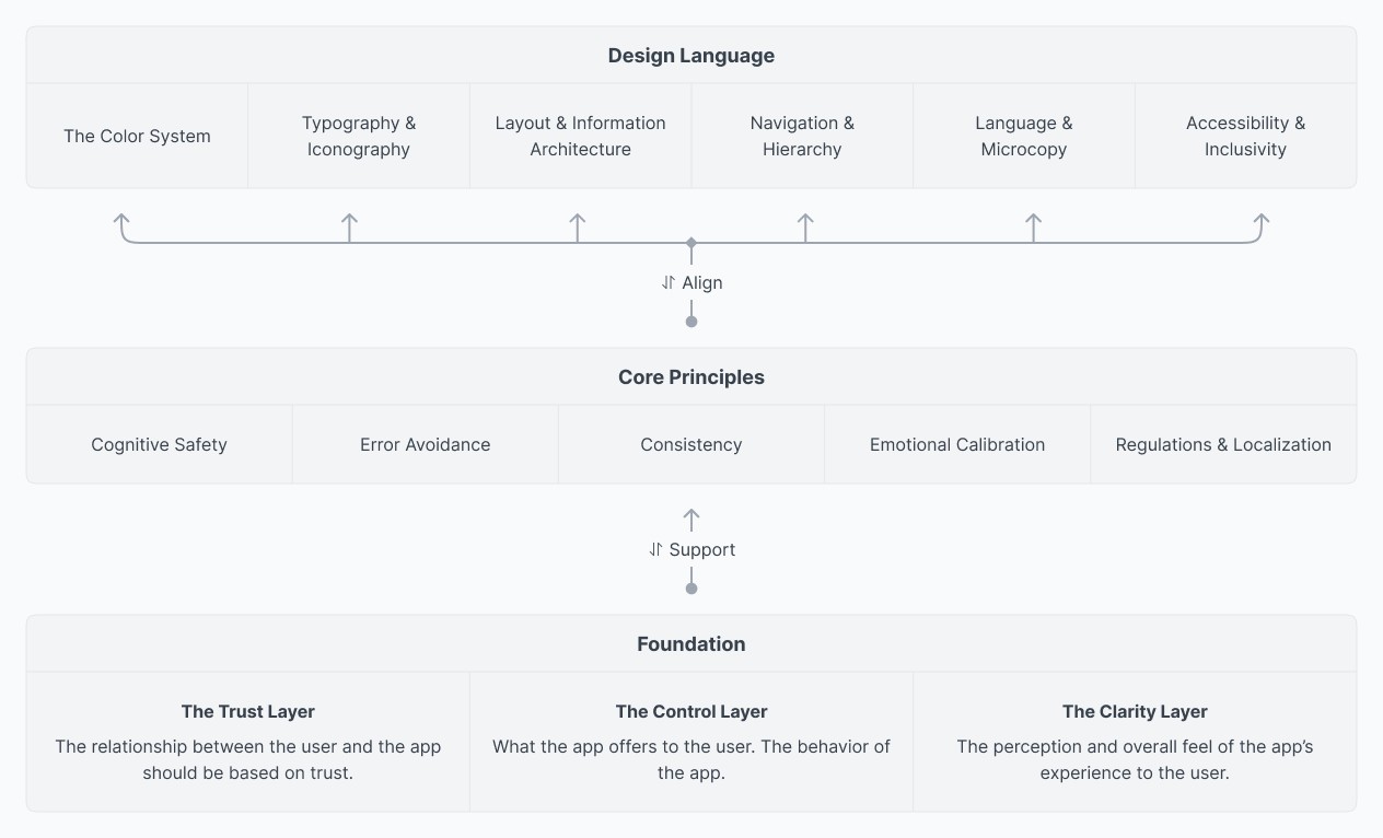
- The visual language: this is what the user sees, interacts with, and can simply be thought of as the interface through which the user experience is delivered. This layer contains all the visual, interactive, and informational elements.
- Core principles: this layer is all about the principles that dictate how the visual language should behave. It acts as an API for the visual language to talk to the foundation layer.
- Foundation: this is the backbone of the whole thing. The user experience starts here. It can be thought of as an immutable source of the user experience. Meaning that once established, it cannot be changed, challenged, or compromised by anything.
We’ll look into this further later on. But for now it’s important to understand how these layers affect each other. As you can see, the visual language has seven different aspects, the core principles have five, and the foundations have three.
The more foundational principles you have, the narrower the range, or the scope of freedom, gets. Meaning we’re limiting ourselves creatively. These foundations come from various sources. Typically, by the end of user research these foundations will be apparent to the designer. As the immutable source and the backbone of the UX, we have to lock these down before moving forward.
The core principles work the other way around in terms of degree of freedom. The more you have, the wider the scope gets. More things to consider, more ways to be creative. So these two layers, foundation and core principles, allow us to define the scope of the visual language. In this case, we have seven ways we can use to establish the user experience.
The last thing we need to understand about the structure of the framework is the relationship between the layers. This is where most designers mess things up. They focus on the colors, typography, and other visual language without looking at how each design decision shapes the user experience. This simple oversight is the single most important mistake most designers make. To avoid making the same mistake, let’s understand the relationship between each layer.
“The visual layer should always align with the core principles. The core principles should always support the foundation.”
The reason is simple. Since the foundations are immutable, we have to be strict about what we do on the visual language layer. We can’t make a button red just because it looks nice. Those kinds of decisions need to agree with the foundations we’ve established. Otherwise it would be a violation, a challenge, and a compromise of the foundations.
So our approach is strategical and also simple. Make sure that the core principles support the foundations established. And then align the design decisions on the visual language layer with the core principles. This way the whole thing becomes a cohesive system. It’ll be quite clear as we go.
Layer #1: Foundational principles
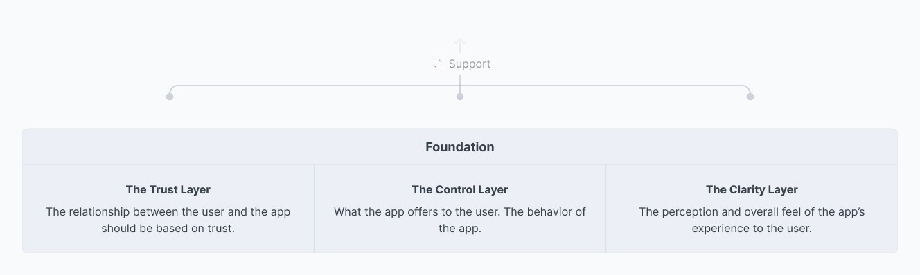
According to the findings of the research, the foundational principles are established. These can be seen as the three pillars that hold the whole thing up. These are:
- Trust: The relationship between the user and the app should always be based on trust.
- Control: The behavior of the app should be about user control.
- Clarity: The user’s perception of the app should always be clarity. This is very important, as transparency is inarguably one of the most important aspects of mobile banking.
As we discussed earlier, fintech apps are heavily regulated. These regulations exist to make sure the app remains safe and secure. Plus, traditionally, user experience design always gravitates toward positive feedback. Based on these two things, we can establish the foundations like this.
To establish these foundations, we can simply ask three basic questions.
- What kind of relationship do we want the user to have with the app?
- What type of behavior or interaction should the app give the user?
- What perception do we want the user to have about the app?
As you can see, our foundations are the answers to these questions.
Foundational principle #1: Trust
Trust is the most important aspect a mobile banking app’s UI can have. To establish the user’s trust also means making sure the safety and security requirements are already fulfilled.
Foundational principle #2: Control
Control simply gives the user the steering wheel, letting them do what they want with the tools available. This gives the user confidence and, overall, more positive feedback.
Foundational principle #3: Clarity
When the user can see everything clearly, what’s going on and how things work, everything becomes simple. Users become less doubtful, and that also helps minimize the risk of user errors.
As you can see, all three pillars work together to create a solid foundation we can build our user experience from. Clarity helps the user have control, and that control helps them trust the system.
As long as we make sure not to change, challenge, or compromise these foundations, we can make sure the UI design will deliver a better user experience.
Layer #2: Core principles
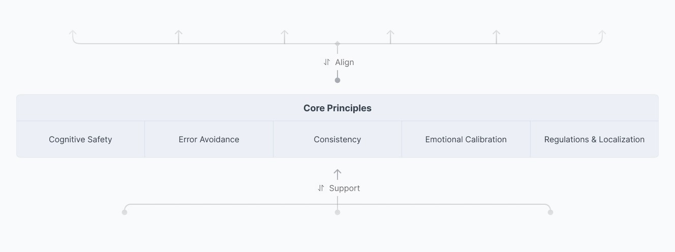
Core principles should support the foundational principles of trust, control, and clarity. Each core principle exists to make sure those foundational values are supported and respected.
Core principle #1: Cognitive safety over minimalism
Banking is inherently stressful for most people, even if it doesn’t feel that way on the surface. The user is accountable for their own finances. Our goal should be to minimize that stress by being strict when necessary, and transparent and careful with the user’s money. Information should be clear and never overwhelming.
Minimalism in this case doesn’t mean lots of white space and fewer UI elements. It simply means that every single thing in the UI should have a function. If something doesn’t serve a purpose, or exists purely as decoration, it should go. This doesn’t have to be true everywhere. But in high-risk situations like fund transfers, we can remove unnecessary decoration and let the user focus on the task at hand.
A minimal UI also satisfies Hick’s Law ↗, by reducing choices to decrease anxiety, and Nielsen’s “aesthetic and minimalist design ↗” heuristic, by stripping away distractions so that critical financial information stays the primary focus.
A minimal design promotes clarity, which gives the user the ability to control, which helps them establish trust.
The aim is to make banking a clear and safe experience, not necessarily to make it purely an enjoyable one.
Core principle #2: Error avoidance over error recovery
Errors are unavoidable. Something somewhere can go wrong at any moment and as designers we can do very little to prevent that from happening. There are system errors which are out of the user’s control. Then there are user errors. Things we can actually do something about. System errors shouldn’t be frequent, and when they happen, we need to tell the user exactly what’s up without making them guess.
When an error occurs, the UI should let the user know. Tell them what happened. Tell them how to get out of it or fix it, if they can. If it’s not fixable by the user, let them know that too. Transparency matters a lot. We must own accountability and responsibility for these errors, and that’s how we should think about acting on them as designers.
We should prioritize error prevention above all else. Financial user errors aren’t recoverable. If a user sends the wrong amount to the wrong person, it’s game over. We’d rather add a bit of friction than let a user accidentally make a mistake like that.
We should minimize the ability to make a mistake in the first place.
When we handle errors correctly, rather than leaving the user to wonder what went wrong, we remove doubt and promote clarity and trust.
Core principle #3: Consistency as a trust signal
Consistency is one of the most important qualities a UI can have to establish a user’s trust. This comes down to one of the most fundamental psychological principles a UI/UX designer should account for: the user’s mental model ↗.
Let’s see how. Consistency comes in three different ways.
- Consistency within the app
- Consistency between different apps
- Consistency between the real world and the app
Consistency within the app
The app has to look the same throughout, consistently. The best way to achieve this is to establish a design system. As most projects do nowadays, a design system will make sure that consistency stays true.
Consistency between different apps
Users use other apps as well. If their banking app looks wildly different and operates in a completely different way, they’ll be confused. This doesn’t mean the banking app has to look exactly like other apps, but having a similar vibe is enough. We can follow conventional design patterns for this.
We shouldn’t drastically change things for the sake of thinking outside the box or in the name of innovation. Honestly, mobile banking isn’t the optimum place to do that. We’ll look at why later on.
Consistency between the real world and the app
Consistency between the real world and the app isn’t a big deal. I’m not saying it’s pointless, but we shouldn’t worry too much about it. A mobile banking app is designed to work on a smartphone. If the user can use the phone, they already know how it works.
Real-world consistency helps in terms of iconography, how information is displayed, and how things operate. For example, if the app shows credit cards, the icon or graphic should represent a physical card. The language itself should also mimic the real world, and the transaction list should follow the same formatting as a financial statement. These things help the user digest information more easily and efficiently.
How consistency helps the user
These different types of consistency help the user in two key ways.
- Learning
- Familiarity
Every user goes through a period of learning when they first start using an app. During this period, the user assesses the app subconsciously. This assessment is based on the effort it takes to learn the app within a certain amount of time. This matters a lot to us, because if a user keeps getting confused, whether due to limited technical knowledge or other factors, they might become scared to use the app. That’s bad UX. As designers, our focus should be to make the user experience better, not worse.
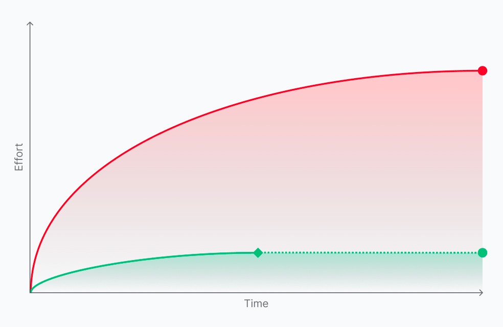
Once a user is comfortable with the app, they build muscle memory. They stop reading the labels. They know where things are, what to do, and when to do them. The only way this level is achieved is with consistency. This is exactly why most people are doubtful about app revamps, and why we need to put so much effort into the revamp process. Because when that effortless experience users have built breaks, they feel overwhelmed and confused, and some of them even hesitate to go through the process of learning the app again.
No matter the situation, the app has to be easy to learn. We could even argue that the less effort it takes to learn an app, the flatter the learning curve, and the better the perceived user experience becomes.
An easier app inherently promotes clarity, which leads to better control, and ultimately establishes the user’s trust.
Core principle #4: Emotional calibration
Different emotions lead to different outcomes. Money has this effect on people, and it can be perceived differently by different people. For some, money may evoke happy feelings; for others, anxiety, guilt, shame, or any number of other feelings. And it’s not just money, either, different situations put users in different emotional states, and those states shape outcomes too. A stressed person’s chance of making a mistake is greater than a calm person’s.
On the surface, emotional states and app design may not seem like such a big deal to worry about. But if we look at it more thoughtfully, we can actually make the user experience much better for everyone.
So how can we calibrate the user’s emotions with UI and visual design?
Let’s take a look at the advertising industry. It uses everything from subtle cues to elaborate design decisions to calibrate people’s emotions. We do the same thing, just in a more controlled and goal-oriented way.
Things like tone of voice and the language we use should be easy for any user to read and understand. Simple layouts, colors, and animations can also help emotionally calibrate the user.
These are the simple things. Now let’s look at a more elaborate scenario.
For example, say we use the primary action button consistently throughout the app. But let’s also have another special action button that looks different. A button that only ever means one specific thing: every time this button is clicked, the user will spend money. This is the button that sits at the end of a fund transfer flow, as a “confirm payment” or “pay now” action.
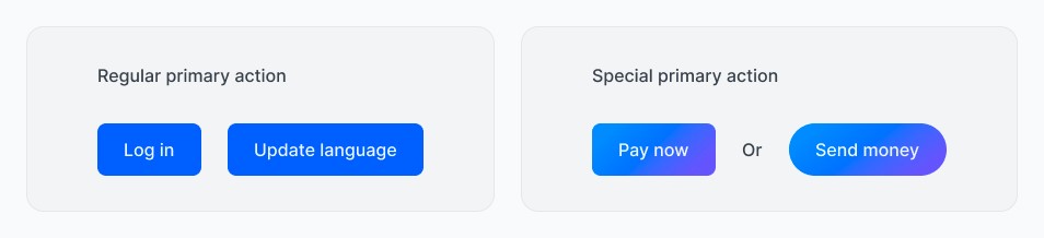
There are rules we have set for this button to exist in our app. Such as:
- Element: It’s limited to one or two specific UI elements (like a main button or icon).
- Context: It only appears when finances are being spent. It must be visually prominent and different from everything else on the screen.
- State: It must represent a significant, progressive action. The final “Confirm” that completes the task.
By being this stingy with your brand color, you achieve two things:
- Zero Ambiguity: The user knows exactly what that button means. No guessing.
- Cognitive Calibration: It builds muscle memory. When that button appears, the user’s brain signals: “Pay attention, money is about to move”.
It may look like we’re contradicting the consistency of our design by using a different-looking button where a primary action button should be. But like I mentioned at the start, this framework is opinionated. And we’re still using this button consistently, for the same purpose, every time. That’s what creates the new context.
Core principle #5: Regulations and localization
As we’ve mentioned a few times already, in most countries, various financial institutions and governing bodies set the rules, guidelines, and best practices that need to be followed when designing and developing fintech apps.
The other aspect is that the users of a fintech app, especially a mobile banking app, can vary widely. Take a single bank as an example: its entire customer base is a potential user of its mobile banking solution. That’s a wide range of backgrounds, abilities, and levels. So in this context, accessibility and inclusivity aren’t optional. They’re the law. The app needs to work for every single person, regardless of their language, physical ability, or technical literacy. That’s a monumental task that requires extreme care.
Language, tone of voice, and how data and information are presented matter a lot. If an app is full of financial jargon and complex information, it can be confusing and stressful for some users. Instead, we must always design for the user with the lowest ability and literacy level first. That way, we make sure everyone can understand the same information equally clearly.
This easier-to-grasp information promotes clarity, which gives the user the ability to control, which helps them establish trust.
Layer #3: The design language
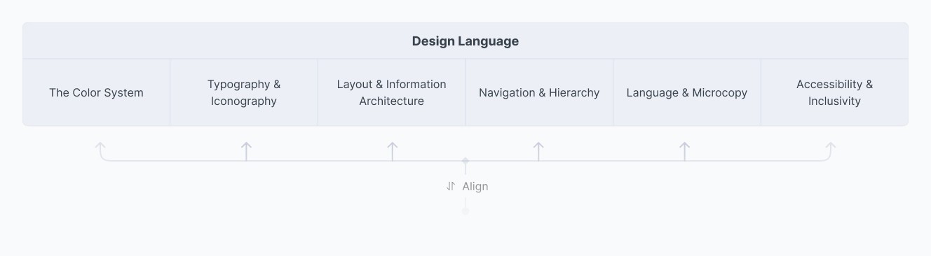
The design language layer consists of the color system, typography, iconography, layout & information architecture, navigation & hierarchy, language & microcopy, and accessibility & inclusivity.
This is the layer where we, as designers, tend to make the most visually apparent mistakes. That’s why we need to follow the framework established above to guide how we approach the visual design. Which is why I want to reiterate the point:
The visual layer should always align with the core principles. The core principles should always support the foundation.
Let’s look at the visual language layer as a whole, instead of going through each individual component in isolation.
These are the basics every designer knows and works with every single time. There’s very little new I have to say about the visual layer itself, partly because it feels like re-iterating things we already know without adding value. But I’ll still talk through it in a way that shows how we align the visual layer with the core principles, so that everything supports the foundation and creates a cohesive UI.
Colors, typography, and iconography
These are the main visual components the visual layer is made of. Most designers make the mistake of beginning their design process here, rather than arriving here after going through the necessary steps we talked about above.
The color system
The color system comes in a few different palettes for a few different purposes: brand colors, primary colors, accent colors, neutral colors, and semantic colors. These are the typical palettes a visual design requires.
The brand color typically comes from the brand identity guidelines, and it’s the color that represents the brand. It’s a very important color and should be used in the app to establish the brand presence, as well as a trust signal.
But here’s the problem. Brand colors often clash with the reality of digital interfaces. Most brand colors aren’t suitable to use as the primary color for an app. I’m sure you can think of plenty of instances of brands using their brand color as primary and ending up with an awkward experience.
This is why it’s important to make sure either the brand color is suitable for the product, or we choose a different color for the product. This doesn’t mean we abandon the brand color entirely. If we use a different color as primary, we can still use the brand color as an accent.
In any case, my point is that we should make sure the colors we use align with the established framework.
How we use color is more important factor than what the actual colors are.
Primary color
The main purpose of the primary color is to signify the primary actions and to guide the user within the app’s visual language. This color, what ever color it is, must have enough contrast, should maintain proper visibility, and be distinguishable from all other colors. Other than that, primary color should follow the standard design guidelines as in any other UI design.
Accent color
Accent colors are there for accents, as the name suggests. They give visual interest. Accents should be regarded as aesthetic features. Some designers would disagree with me on this, but in this particular case at least, accent colors should be used purely as decoration, which limits the functional weight they carry.
Neutral colors
Neutral colors are the gray-ish colors you use in your design, for elements like text, backgrounds, and borders. Depending on the design, this may change, but the underlying principle stays true. Neutrals should have two important qualities: one, they should blend in with the UI to create a cohesive environment; two, they should have enough contrast to pop and stay legible when they need to. That’s why we usually need more than two or three neutral colors in this palette.
Semantic colors (feedback)
Semantic colors are reserved colors that displays meaning, and intent to the user on status and state of things. These are the typical meanings associated with these colors.
- Red means error or destructive actions.
- Yellow means warnings or pending/unprocessed states or actions.
- Green means success, availability, and completeness.
- Blue signifies information, ongoing tasks, processing, or interactivity.
These colors should not be used for other meanings. This is very important. If you need a red for something else, use a different red. The reserved nature of semantic colors is that important. And it doesn’t stop at color. Each of these should also be paired with a reserved icon, one that means the same thing every time it appears. We’ll get to that in the iconography section.
Typography
Typography is where legibility and hierarchy do most of the work. And in a mobile banking app, both matter more than they do almost anywhere else, because the thing users are reading is often a number that decides whether they can pay rent this month.
Start with the typeface itself. A clean, well-tested sans-serif is almost always the right call. Not because sans-serifs are inherently more “modern” or “trustworthy,” those are marketing claims, not design facts, but because they render more consistently and legibly across the range of screen sizes and pixel densities a banking app has to support. Save decorative or expressive type for marketing pages. It has no place near a balance or a transaction.
Numbers deserve special attention. Most typefaces ship with tabular figures, a version of the numerals where every digit takes up the same width. Use them anywhere numbers stack vertically, account balances, transaction lists, exchange rates. Without tabular figures, a “1” and a “8” take up different amounts of horizontal space, so the decimal points in a list of amounts drift out of alignment and the whole table looks like it’s wobbling. That’s a small technical detail with an outsized effect on clarity.
Hierarchy is the other half of the job. In most screens there’s one number that matters more than everything else on it, an account balance, a transfer amount, a total due. That number should be unmistakably the largest and heaviest element on the screen. Supporting information, labels, timestamps, fine print, should recede through size and weight, not through color alone. This matters for a reason we’ll come back to in accessibility: color-only distinctions break down for a meaningful share of users. Weight and size don’t.
Good typography promotes clarity, which gives the user control over what they’re looking at and why, and that clarity is what lets them trust the number on the screen.
Iconography
Icons are a shortcut. A well-designed icon lets a user recognize an action or a status faster than reading a word would. But a shortcut that’s misread is worse than no shortcut at all, and in a banking app, a misread icon can mean a misread transaction.
This is where the reserved-icon idea from the color section comes back. If green means success and is always paired with a checkmark, then a checkmark should never appear for anything except success, anywhere in the app. The same discipline applies to every semantic pairing: one icon, one meaning, no exceptions. This is really just consistency within the app, applied to a single visual element instead of the whole system, but it’s worth calling out on its own because icons get reused sloppily more often than any other UI element. A designer reaches for a generic “arrow” or “checkmark” glyph because it’s on hand, not because it’s the one reserved for that state.
Icons should also lean on real-world consistency wherever possible. A credit card icon should look like a card. A transfer icon should suggest movement between two points. Users bring expectations from the physical world and from every other app on their phone, and fighting those expectations for the sake of a more “distinctive” icon set adds friction for no real benefit.
One rule I’d treat as close to non-negotiable: in any flow where money moves, an icon never stands alone. It’s always paired with a text label. Icons are fast to recognize, but they’re also easy to misread, especially under stress, and stress is the default emotional state of someone moving money. Pairing icon with text is a small bit of error avoidance that costs almost nothing in visual weight.
Reserved, consistent icons remove ambiguity, which is clarity. Clarity is what lets the user act with control. And a user who never has to guess what an icon means is a user who trusts the app.
Layout & information architecture
Layout is where the “cognitive safety over minimalism” principle becomes concrete. It’s not about how few elements are on a screen. It’s about whether every element earns its place, and in what order the user encounters them.
The clearest application of this is progressive disclosure. High-risk flows, a fund transfer is the obvious example, should reveal information and choices one deliberate step at a time rather than dumping every option onto a single screen. Pick a recipient. Then an amount. Then review. Each screen should have exactly one job. This isn’t about making the flow feel shorter; a multi-step flow with one decision per screen is often slower than a single dense form, and that’s fine. Slower and clearer beats fast and error-prone every time in this context.
The one place this principle inverts is the confirmation screen. Right before an irreversible action, we want everything visible at once: the amount, the recipient, any fees, the account it’s coming from. Nothing should be hidden behind a scroll or a “see more” link on that screen. This is the one moment where completeness matters more than restraint, because it’s the last chance to catch a mistake before it becomes real.
Grouping matters just as much as sequencing. Group things the way the user’s mental model groups them, not the way your database schema groups them. Accounts, cards, and recurring payments should be organized the way a person actually thinks about their money, not the way they’re stored on the backend. This is real-world consistency again, showing up at the structural level instead of the icon level.
A layout that reveals the right information at the right moment, and groups it the way people already think about it, is a layout that promotes clarity. Clarity gives the user control over the flow they’re in. And a flow that never surprises them is one they learn to trust.
Navigation & hierarchy
Navigation is where consistency between apps earns its keep. Bottom tab bars, a hamburger menu tucked in a predictable corner, a back arrow in the top left, these conventions exist because millions of users have already learned them somewhere else. A banking app that reinvents its navigation to feel “distinctive” is asking the user to relearn something they already know, for no functional benefit. Save the distinctiveness for the brand moments, not the wayfinding.
The more important rule, though, is about escape routes. Every step of a high-risk flow needs an obvious, working way to back out or cancel. Not a way out that technically exists if you know to swipe from the edge of the screen, an obvious one. This is control, stated as plainly as the framework gets: a user who feels trapped inside a flow, even for a second, is a user whose trust just took a hit, whether or not anything actually went wrong.
Hierarchy of actions is the other half. On any given screen, there should be one clear primary action, a smaller set of secondary actions, and a clearly deprioritized way to cancel or go back. This is where the emotionally calibrated “pay now” button from earlier comes back into play: it should sit at the top of that hierarchy, visually distinct from routine navigation, precisely because it means something routine navigation doesn’t.
Predictable navigation and honest escape routes give the user control over where they are and where they’re going. That sense of control is what builds trust over repeated use, and it’s what keeps the experience clear, because the user is never guessing about what happens next.
Language & microcopy
Microcopy is the layer most designers treat as an afterthought, handed off to whoever’s free, when it’s often the single biggest lever for clarity in the whole app.
The baseline is plain language. This connects directly back to core principle #5: design for the lowest ability and literacy level first. That doesn’t mean dumbing anything down, it means not making a user reach for a financial glossary to understand their own account. “Available balance” beats “net disposable liquidity.” If a regulatory term must appear, pair it with a plain-language explanation rather than assuming the user already knows it.
Button and action labels should say exactly what will happen, not just acknowledge the request. “Confirm” is ambiguous. “Send $250 to Jane” is not. This costs a few extra characters and removes essentially all ambiguity about what tapping the button actually does, which is exactly the kind of trade this framework asks us to make.
Error copy deserves the same care we described under core principle #2. Tell the user what happened, in plain terms. Tell them whether it’s something they can fix, and if so, how. Never leave them staring at a red banner guessing what went wrong or what to do next. “Transfer failed. Your account wasn’t charged. Try again or contact support” does more work than “Something went wrong.”
Tone matters throughout, not just in errors. Calm, direct, and respectful, never cute or alarmist. Banking copy that tries too hard to be playful can undercut trust in a context where the user wants competence, not personality.
Plain, specific, honest language is clarity in its most literal form. That clarity gives the user real control over their decisions, because they always know what they’re agreeing to. And a product that never hides behind vague language is one users learn to trust.
Accessibility & inclusivity
Accessibility isn’t a nice-to-have layered on top of the visual language. It’s the foundation showing up directly in the pixels, because core principle #5 told us plainly: for a mobile banking app, accessibility and inclusivity aren’t optional, they’re the law in most jurisdictions.
Contrast is the most measurable place to start. WCAG 2.2 sets a minimum contrast ratio of 4.5:1 for normal text and 3:1 for large text (18pt and above, or 14pt bold and above) against its background. This isn’t a suggestion, it’s the baseline for AA conformance, and financial apps should be hitting it everywhere, not just on the screens someone remembered to audit. Text also needs to support the device’s scalable/dynamic type settings rather than being locked to a fixed size, since a meaningful share of users, especially older users managing their own finances, rely on larger system text.
Screen reader support has to extend to every icon and status indicator we talked about above, not just to body text. A green checkmark that reads as nothing more than “image” to a screen reader has failed the same user a low-contrast color pairing would fail. Every semantic icon needs a real accessible label that states what it means, not just what it looks like.
Localization is accessibility’s other half. Currency formatting, date formats, and number formatting all vary by region, and getting them wrong doesn’t just look unpolished, it can make a user misread an amount. Translated microcopy has to meet the exact same plain-language bar as the original, not a rougher, less-reviewed version of it. A translation that’s technically accurate but harder to parse than the source text has quietly reintroduced the confusion we spent the whole language section trying to remove.
None of this is optional polish. It’s the most direct expression of clarity the framework has, because an interface that a meaningful number of users literally cannot perceive or parse has failed at clarity before any other layer even gets evaluated. That clarity is what gives every user, not just the ones the designer happened to test with, real control. And a product that works for everyone it claims to serve is the clearest possible signal of trust.
Conclusion
That’s the full framework, three layers, feeding into each other in one direction only. Foundation locks in trust, control, and clarity as immutable. Core principles support that foundation. The visual language aligns with the core principles. Nothing at the top should ever be allowed to challenge what’s underneath it.
I want to be clear about what this framework is and isn’t. It isn’t a rulebook that replaces user research, testing, or judgment. It’s a lens, a way of checking whether a design decision at the button-and-color level can actually trace its reasoning all the way down to something that matters. If a decision can’t answer “which core principle does this support, and which foundation does that principle protect,” that’s usually a sign the decision was made for the wrong reasons, because it looked nice, because a stakeholder liked it, because it was faster to ship.
Mobile banking will keep getting harder to design well, not easier. Regulation tightens. User expectations keep rising because every other app they use keeps getting smoother. And the cost of a bad design decision in this category isn’t a bad review, it’s someone’s money. That’s exactly why I think it’s worth having a framework this opinionated. Not because it’s the only correct answer, but because in a domain this high-stakes, a designer needs something sturdier than taste to lean on.
Visual layer should always align with the core principles. The core principles should always support the foundation.
If you take one thing from this case study, take that line. Everything else is just what it looks like when you follow it all the way down.
Related reading

User-Friendly by Design - The Key to Creating Intuitive, User-Friendly Designs
In this post, Oshada breaks down Jakob Nielsen's 10 usability heuristics, offering practical tips and psychological insights for designing intuitive, seamless interfaces. With real-world examples and actionable advice, whether you're just starting out or already a UX pro, these guidelines will help take your design game to the next level.
Design Systems - The Architects of Digital Innovation
In the thrilling landscape of digital design, design systems have emerged as transformative forces, reshaping how teams collaborate and create. These systems empower creators to forge seamless, captivating user experiences. In this epic journey, design systems become the architects of innovation, where creativity flourishes within the bounds of structure.
The Art and Science of Color in Design
Unleash the power of color in design! This guide explores the science and psychology behind color, helping you create captivating visuals. Master the art of stunning designs where every hue speaks clearly. Let’s get colorful!